# Here are the libraries I used
library(tidyverse)
library(knitr)
library(readr)
library(ggpubr)6 Residual Diagnostics
We will expand on these regression topics some when we move on to multiple regression.
Here are some code chunks that setup this document.
# This changes the default theme of ggplot
old.theme <- theme_get()
theme_set(theme_bw())
beer <- read.csv(here::here("datasets",
"beer.csv"))
beers.lm <- lm(Calories ~ ABV, beer)6.1 Validating the Model and Statistical Inference: The Residuals
\[y = \beta_0 + \beta_1 x + \epsilon\]
\(\epsilon \sim N(0,\sigma)\)
There are assumptions that this model implies:
The error terms are normally distributed.
The error terms for all observation have a mean of zero which implies the model is unbiased,i.e, there is truly and only a linear relationship between \(x\) and \(y\).
The error terms have the same/constant standard deviation/variability that does not depend on where we look at along the line. This is referred to as homogeneity of variance.
A required assumption is that the error terms of the observations are all independent of each other.
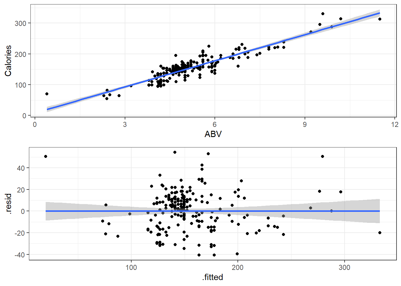
ggplot(beer,
       aes(x=ABV,y=Calories)) + geom_point() +
  geom_smooth(method = "lm",
              formula = y~x)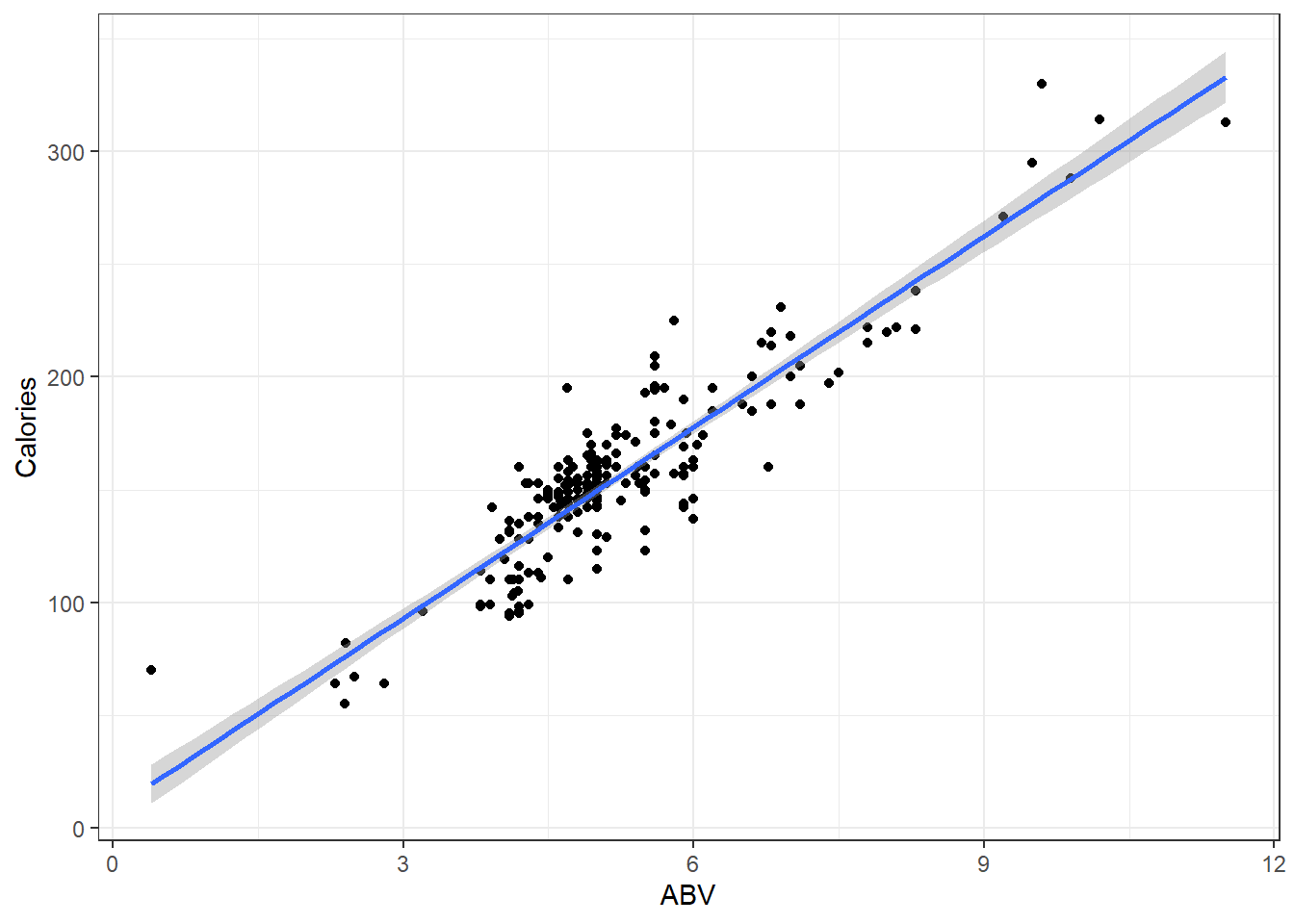
6.2 Residuals
We estimate the error using what are referred to as residuals:
\[e_i = y_i - \hat y_i = y_i - (\beta_0 + \beta_i x_i)\]
- \(y_i\) is observed value of y
- \(\hat y_i\) is “fitted” value of y
summary(beers.lm)
Call:
lm(formula = Calories ~ ABV, data = beer)

Residuals:
    Min      1Q  Median      3Q     Max
-40.738 -13.952   1.692  10.848  54.268

Coefficients:
            Estimate Std. Error t value Pr(>|t|)
(Intercept)   8.2464     4.7262   1.745   0.0824 .
ABV          28.2485     0.8857  31.893   <2e-16 ***
---
Signif. codes:  0 '***' 0.001 '**' 0.01 '*' 0.05 '.' 0.1 ' ' 1

Residual standard error: 17.48 on 224 degrees of freedom
Multiple R-squared:  0.8195,    Adjusted R-squared:  0.8187
F-statistic:  1017 on 1 and 224 DF,  p-value: < 2.2e-16
6.3 Checking Normality
You can use beers.lm in ggplot(). Use .resid for the variable you want to graph.
# The histogram function needs you
# to tell it how many bins you want.

ggplot(beers.lm, aes(x = .resid)) +
  geom_histogram(bins = 15,
                 color = "black", fill = "white")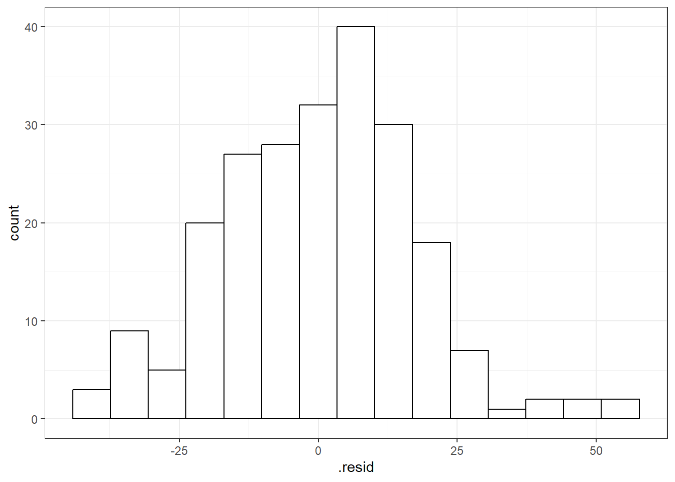
6.3.1 QQ-Plots (QQ stands for QuantileQuantile)
Quantile-Quantile Plot or Probability Plot:
- Order the residuals: \(e_{(1)}, e_{(2)}, ..., e_{(n)}\)
- The parentheses in the denominator indicate that the values are ordered from 1st to last in terms of least to greatest.
- \(e_{(1)}\) is the minimum, \(e_{(n)}\) is the maximum and then there is everything in between.
- Find \(z\) values from the standard normal distribution that match the following:
\[P(Z \leq z_{(i)}) = \frac{3i - 1}{3n -1}\] 3. Plot the \(e_{(i)}\) values against the \(z_{(i)}\) values. You should see a straight line.
6.3.1.1 Good normal QQ-plot:
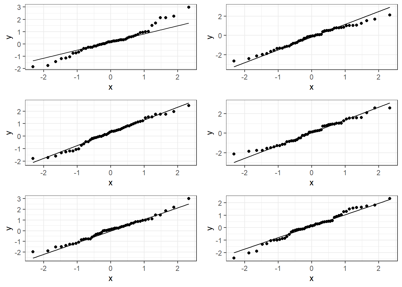
6.3.1.2 Bad plots:
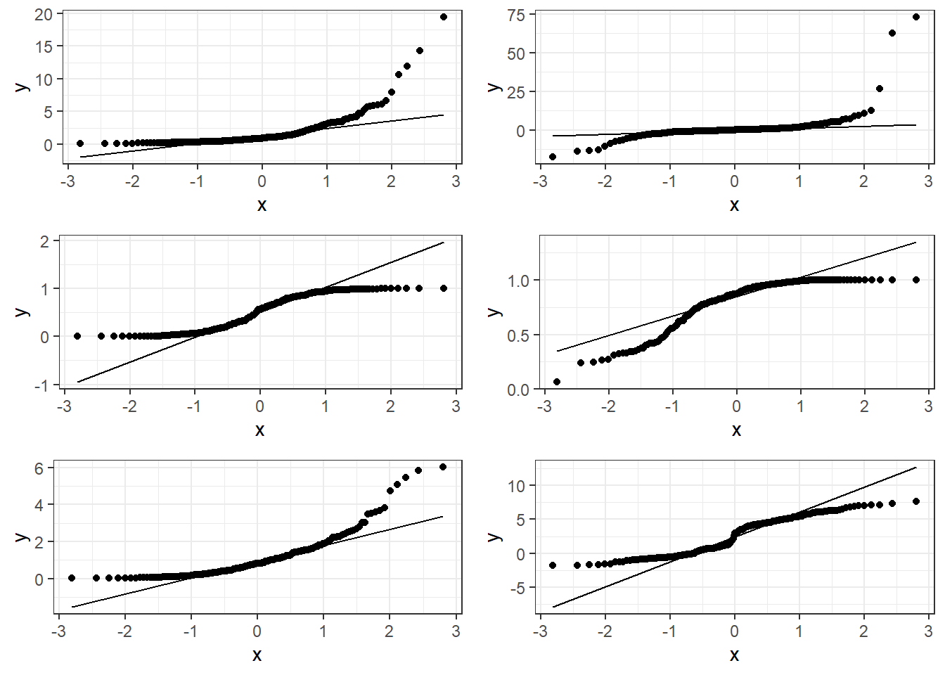
6.3.1.3 Beer QQ Plot
ggplot(beers.lm, aes(sample = .resid)) +
  stat_qq() + stat_qq_line()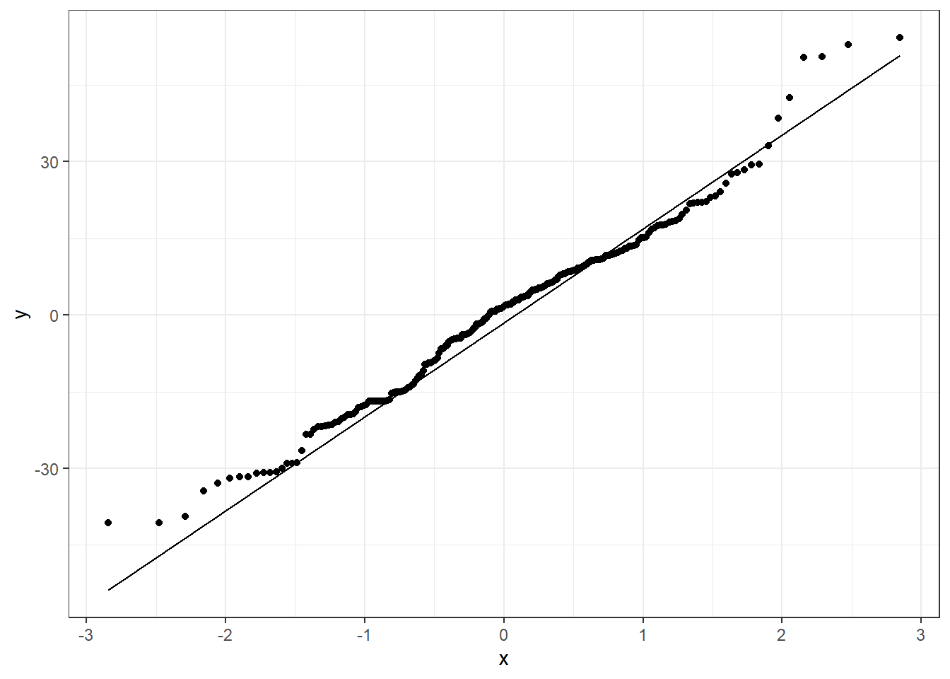
Things for the most part look good.
- There is some deviation at the tails, but that’s expected.
- Essentially there is not much of a pattern to the deviation from the line except for the tails.
- This is honestly pretty ideal and somewhat rare for what we would see in the real world.
6.3.2 Hypothesis Tests for Normality
The hypotheses are:
\(H_0:\) Data are normally distributed \(H_1:\) Data are not normally distributed.
One such test is the Shapiro-Wilk Test which should only be used on model residuals
shapiro.test(beers.lm$residuals)
    Shapiro-Wilk normality test

data:  beers.lm$residuals
W = 0.98379, p-value = 0.01097
6.4 Residual Plots for Assessing Bias and Variance Homogeneity
Residual plots are where we plot the residuals on the vertical axis (y-axis) and the fitted values or observed \(x_i\) values from the data on the horizontal (x-axis).
We can use beers.lm in ggplot().
.fittedcan be used for the fitted values variable..residcan be used for the residuals values variable.
ggplot(beers.lm, aes(x = .fitted, y = .resid)) +
  geom_point() +
  geom_smooth(method = "lm")
6.4.1 Premise of Residual Plots
This is a way to assess whether the mean of the residuals is consistently zero across the regression line.
- This is checking whether the model is biased or not.
- If we see some sort of pattern where the residuals change direction, that means the data do not follow a linear pattern.
It also lets us assess whether the variaibility is constant.
- The residuals should form a pattern with equal vertical dispersion throughout.
- If we see a pattern of increasing or decreasing spread, then the constant variance (homogeneity/homoskedasticity) assumption is violated.
In general, you are look for randomly scattered points with no patterns whatsoever.
The residual plot should form basically a circle or ellipse.
6.4.2 Good Residual Plots
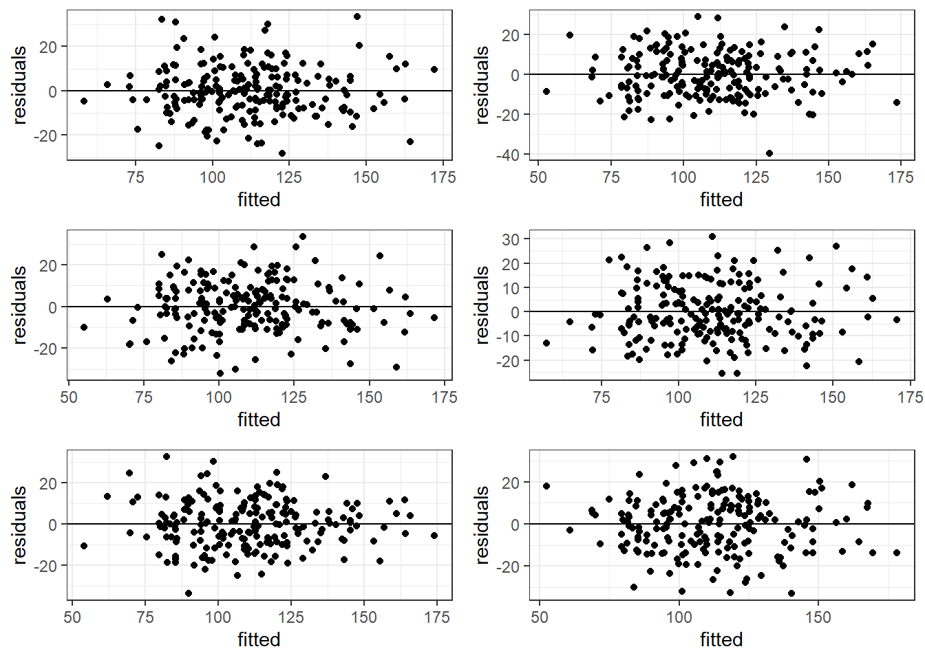
The plots are centered at zero across there isn’t much to say the variability is not constant across the whole plot.
6.4.3 Bad Residual Plots
- Top left plot shows increasing variability but mean of 0. Unbiased and heterogeneous variance.
- Top right show increasing variability AND mean of not 0 consistently. Biased and heterogeneous variance.
- Bottom left shows the mean not being consistently 0. Biased but homogeneous variance.
- Bottom right shows a definite curvature and potential outliers.
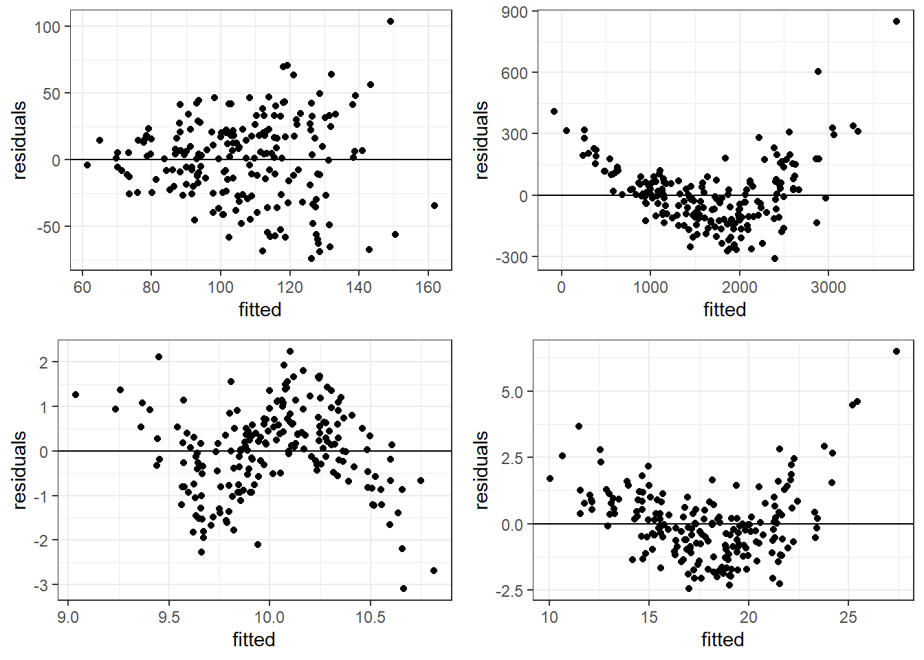
6.4.3.1 Beer Data Residual Plots
Let’s look at our beer data residual plots.
ggplot(beers.lm, aes(x = .fitted, y =.resid)) +
  geom_point() +
  geom_smooth(method = "lm")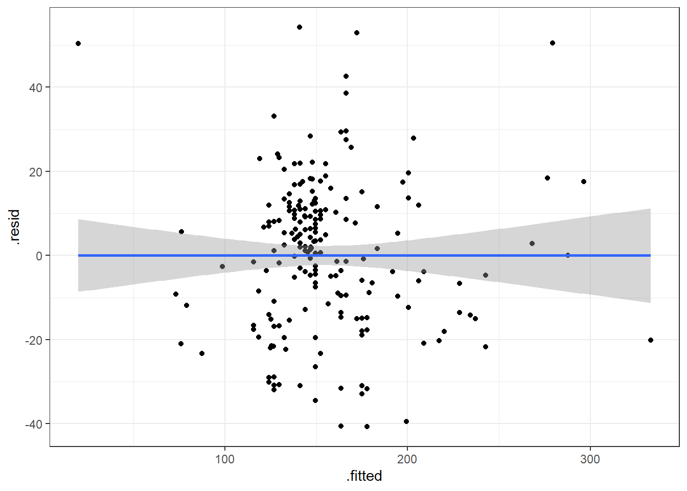
This plot looks mostly fine. There are a few points that stick out on the far right and far left. The most peculiar one is in the top left.
It has the smallest fitted value, so let’s pull that one out.
| Calories | Beer | ABV |
|---|---|---|
| 70 | O’Doul’s | 0.4 |
O’Douls is a “non-alcoholic” beer. It may not be considered representative of our data. We could justify removing it from the data we are analyzing if our objective is analyze “alcoholic” beverages.
6.5 Outliers
Outliers are values that separate themselves from the rest of the data in some “significant way”.
- How do we decide what is, and what is not an outlier.
standardized residuals:
\[z_i = \frac{e_i}{\widehat \sigma_\epsilon} = \frac{y_i - \hat y}{\widehat \sigma_\epsilon}\]
studentized residuals:
\[z^*_i = \frac{e_i}{\widehat \sigma_\epsilon \sqrt{1-h_i}}\]
\(h_i\) is a measure of “leverage”. Leverage is a measure of how extreme a value is in terms of the predictor variable. It indicates the possibility that the outlier could strong influence the estimated regression line.
Sometimes, we use the square root of the standardized/studentized residuals, \(\sqrt{|z_i|}\), to determine outliers. Then we would be looking for values that exceed \(\sqrt{3}\approx 1.7\).
6.6 Alternative Way to Get Residual Diagnostics Graphs
There is a library called ggfortify which has a function that creates some useful plots. It is the autoplot() function.
This function only requires your lm model as an input to work. We’ll do this on the original model.
library(ggfortify)

autoplot(beers.lm)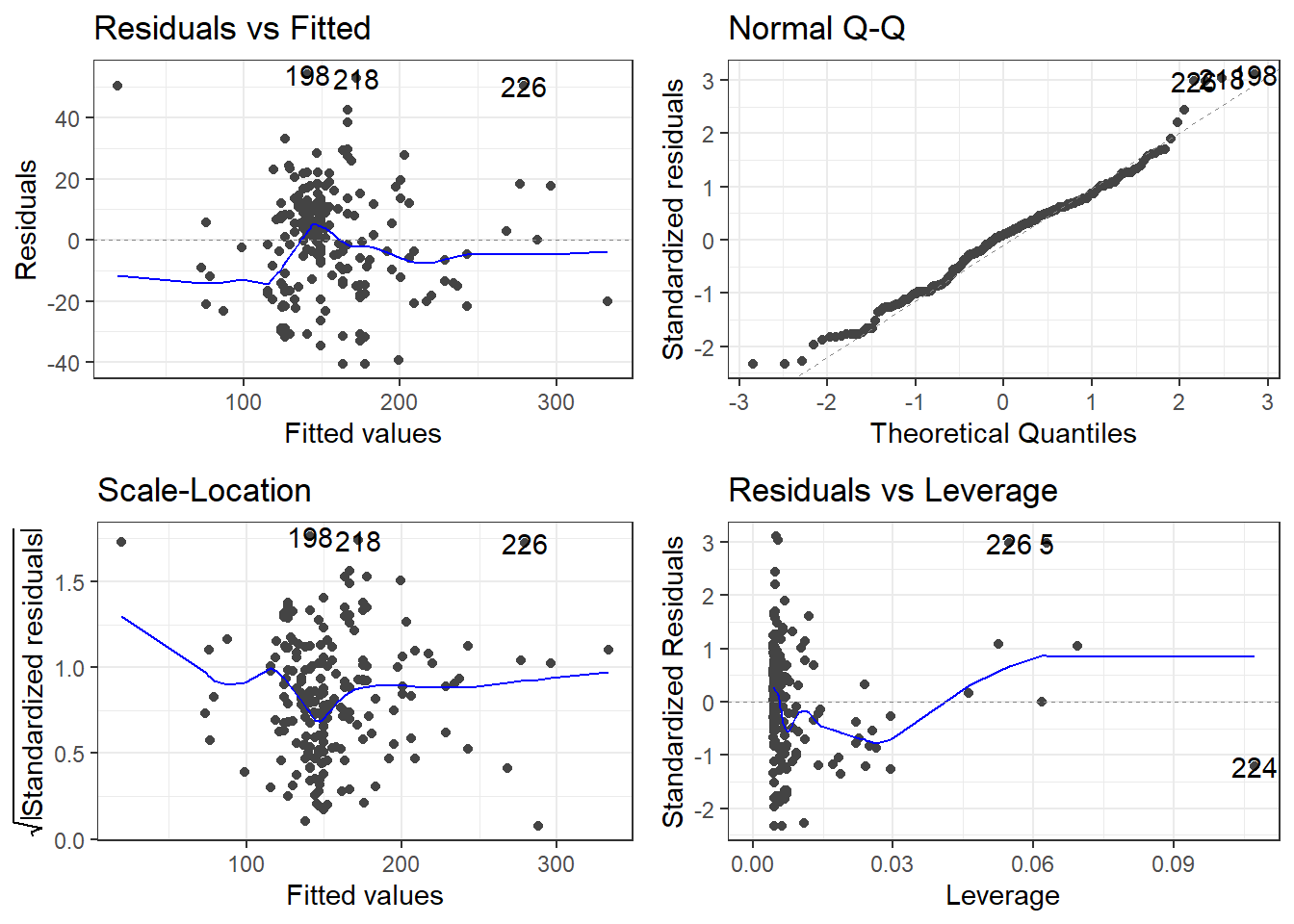
The scale-location plot is a plot of the square root of the standardized/studentized residuals versus the fitted values.
The residuals versus leverage plot. Leverage is essentially a measure of how much potential an observation has for causing a significant change in the line. If an outlier has relatively high leverage, it may be having a large enough impact on the fitted line, that the line is less accurate because of the outlier.
autoplot()automatically labels which observations you may want to consider investigating by tagging observations with which row, numerically, it is in the data.
There is also the performance and see R packages that can be help in checking models.
library(performance)
library(see)

# Test
check_outliers(beers.lm, method = "cook")
OK: No outliers detected.
- Based on the following method and threshold: cook (0.7).
- For variable: (Whole model)# plot
plot(check_outliers(beers.lm))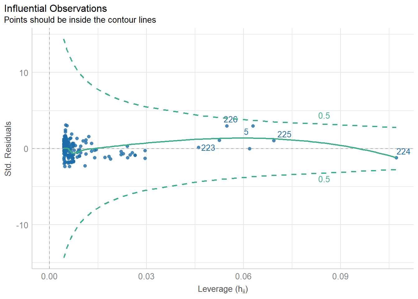
6.7 Getting Outliers from the Data.
data[rows,columns] * Specify the number(s) for which row(s) you want. Leave blank if you want to see all rows. * Specify the number(s) which column(s) you want. Leave blank if you want to see all columns.
Remember, each row in the dataset is a beer. We want to specify just the rows so we can see all the information about each beer we are checking.
# Store the indicated outlier numbers as a vector.

outlierRows <- c(198, 218, 226, 5, 224)

beer[outlierRows, ]
Calories Beer ABV
198 195 Sam Adams Cream Stout 4.69
218 225 Sierra Nevada Stout 5.80
226 330 Sierra Nevada Bigfoot 9.60
5 70 O'Doul's 0.40
224 313 Flying Dog Double Dog\xe5\xca 11.50Maybe there is a pattern here. Maybe these observations should be omitted? If we omit observations, we reduce the generalizability of the model. Generalizability is the ability for a model to apply to a greater population and future predictions.
6.7.1 New Model Without O’Doul’s
Remove outlier(s):
Make a new model.
New residuals check.
Compare to previous model.
beer2 <- filter(beer, Beer != "O'Doul's")

beer2.lm <- lm(Calories ~ ABV, beer2)

summary(beer2.lm)
Call:
lm(formula = Calories ~ ABV, data = beer2)

Residuals:
    Min      1Q  Median      3Q     Max
-41.046 -14.277   1.753  11.081  54.824

Coefficients:
            Estimate Std. Error t value Pr(>|t|)
(Intercept)   4.5978     4.7950   0.959    0.339
ABV          28.9080     0.8966  32.241   <2e-16 ***
---
Signif. codes:  0 '***' 0.001 '**' 0.01 '*' 0.05 '.' 0.1 ' ' 1

Residual standard error: 17.17 on 223 degrees of freedom
Multiple R-squared:  0.8234,    Adjusted R-squared:  0.8226
F-statistic: 1039 on 1 and 223 DF, p-value: < 2.2e-16autoplot(beer2.lm)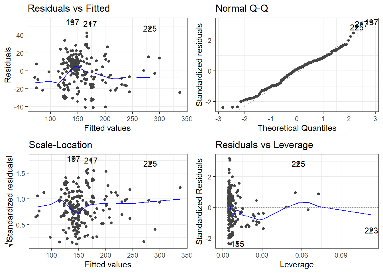
6.8 Specifics of Residual Plots in Simple Linear Regression
One thing to note is that residual plots in simple linear regression are somewhat redundant.
Left: ABV versus Calories
Right: fitted versus residuals
Can you spot the difference? (Besides scale.)
6.8.1 Fitted versus Observed
Another alternative plot is that of actual versus predicted.
- Actual \(y\) values on one axis.
- Predicted \(\hat y\) values on the other axis.
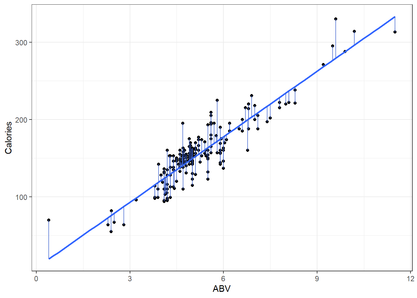
You are looking for a 45 degree line with constant dispersion around the line throughout.
Here it is for the beer data.
ggplot(beers.lm, aes(x = Calories, y = .fitted)) +
  geom_abline(slope = 1,
              color = "royalblue", size = 1) +
  geom_point()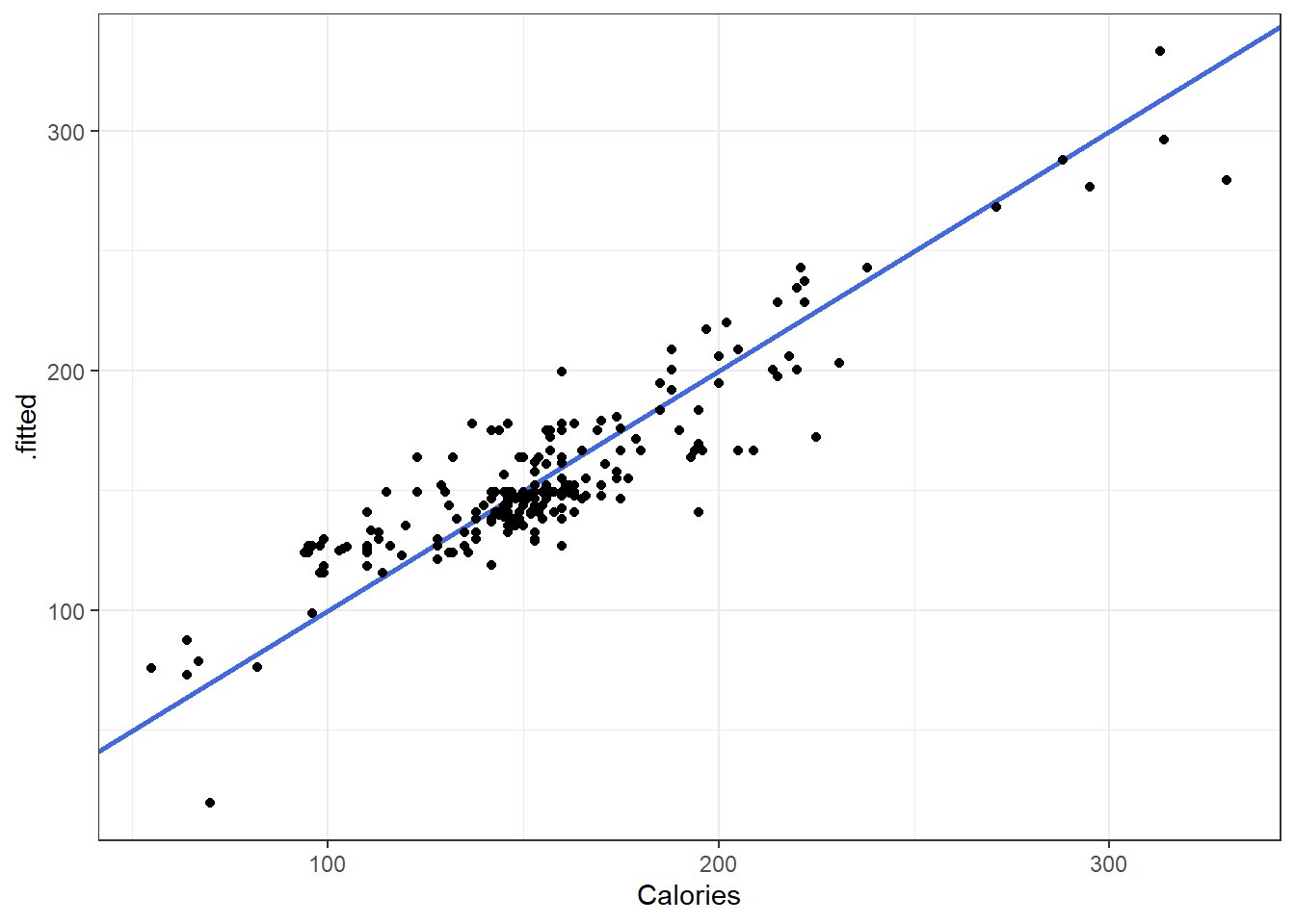
6.8.2 General Model Checks
The R see package can also be used to create a general plots for model assumptions
check_model(beers.lm)