knitr::opts_chunk$set(echo = TRUE, tidy = TRUE,
                      cache = T, message = FALSE, warning = FALSE)
# Very standard packages
library(tidyverse)
library(knitr)
library(ggpubr)
library(readr)
library(gridExtra)
library(ggstatsplot)
library(performance)
library(parameters)
library(effectsize)
# Globally changing the default ggplot theme.

## store default
old.theme <- theme_get()

## Change it to theme_bw(); i don't like the grey background.
## Look up other themes to find your favorite!
theme_set(theme_bw())3 Module 3: Simple Linear Regression
The Model, Estimating the Line, and Coefficient Inference
3.1 Statistical Models
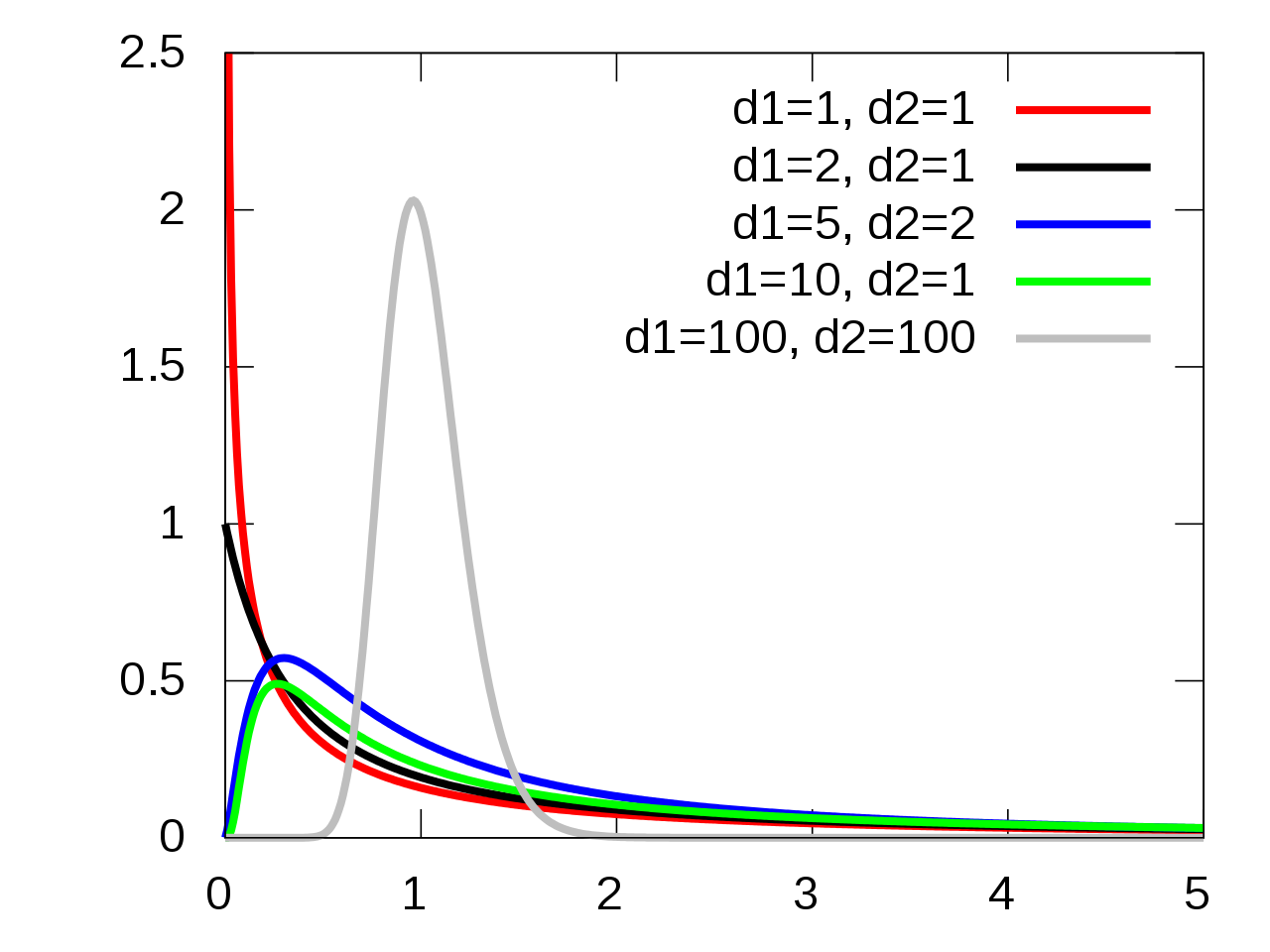
Simple Model:
\[Y \sim N(\mu, \sigma)\]
This can be translated to:
\[Y = \mu + \epsilon\]
Where \(\epsilon \sim N(0, \sigma)\).
This second form is the basis for linear models:
- The mean of a random variable \(Y\) can be written as a linear equation which in this case would be just a flat line.
- There is an error term \(\epsilon\) that describes the deviation we expect to see from the mean.
- \(\epsilon\) having a mean of 0 means that the linear equation for the mean of \(Y\) is correctly specified.
- By correctly specified I mean that we don’t know what the actual mean of \(Y\) is, we are just crossing our fingers.
A more general model would be:
\[Y = g(x) + \epsilon\]
- \(g(x)\) represents some sort of function with an argument \(x\) which outputs some constant.
- \(g(x)\) is the deterministic portion of our model, i.e., it always gives the same output when given a single input.
- \(\epsilon\) is the random component of our model.
- The whole entire point of statistics is that there is randomness and we have to figure out how to deal with it.
- We try to distill the signal \(g(x)\) out of the noise \(\epsilon\) of chaos/randomness. (Maybe overly “poetic”)
Anyway, we try to take a stab at (guess) what the structure of \(g()\) is.
\(Y = \mu + \epsilon\) with \(\epsilon \sim N(0, \sigma)\) is about as simple of a model as we get.
We will assume from hereon that \(\epsilon \sim N(0, \sigma)\)
3.1.1 The Linear Regression Model
We assume that the mean is some linear function of some variables \(x_1\) through \(x_k\).
\[Y = \beta_0 + \sum_{i=1}^k\beta_i x_i + \epsilon\]
We will first start with the simplest linear regression model which is one that has only one input variable.
\[Y = \beta_0 + \beta_1 x + \epsilon\]
This gives us the form for how we could picture the data produced by the system we try to model.
n = 50

# Need x values
dat <- data.frame(x = rnorm(n, 33, 5))  #n, mu, sigma

# need a value for coefficients.
B <- c(300, -5)  # don't forget the y-intercept.

# Deterministic portion
dat$mu_y <- B[1] + B[2] * dat$x

# Introducing error
dat$err <- rnorm(n, 0, 20)

dat$y <- dat$mu_y + dat$err

ggplot(dat, aes(x = x, y = y)) + geom_point(data = dat, mapping = aes(x = x, y = mu_y),
    col = "red") + geom_point(data = dat, mapping = aes(x = x, y = y), col = "blue") +
    geom_segment(aes(xend = x, yend = mu_y), alpha = 0.8, col = "royalblue3") + geom_abline(intercept = B[1],
    slope = B[2]) + theme_bw()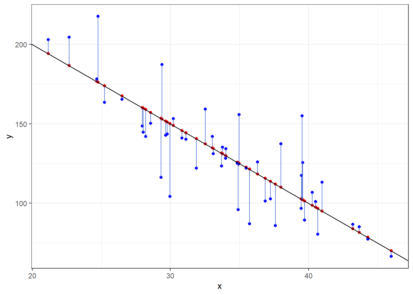
- The black line is the true mean of \(Y\) at a given value of \(x\): \(\mu_{y|x} = 300 -5x\)
- The red dots are randomly chosen points along the line.
- The blue dots are what happens when we include that error term \(\epsilon\) and shows how actual observations deviate from the line.
- Run this code a few times to see things sample to sample.
3.1.2 Comparing the Real to the Ideal
Here is data on 226 beers: ABV and Calories per 12oz.
Alcohol “contains” calories, so the more alcohol in a beer means more calories!
Assuming you have a 12 ounce mixture of water and pure alcohol (ethanol) the exact equation for the number of calories based on ABV denoted by \(x\) is
\[f(x) = 19.05x + 0\]
Let’s plot out the data on the beers and that equation.
beer <- read.csv(here::here("datasets", "beer.csv"))

ggplot(beer, aes(x = ABV, y = Calories)) + geom_point() + geom_abline(slope = 19.05,
    col = "red")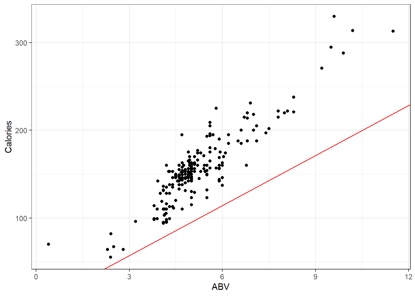
Looks like that misses the mark. I suppose there is other stuff in beer besides alcohol.
So if were to plot a line for the actual on hand, perhaps you will agree that the one in blue is a “good” one.
## OLD CODE ggplot(beer, aes(x = ABV, y = Calories)) + geom_smooth(method =
## 'lm', se = F) + geom_point() + geom_abline(slope = 19.05, col = 'red') +
## stat_cor()

# NEW CODE
ggscatterstats(data = beer, x = ABV, y = Calories, bf.message = FALSE, marginal = FALSE) +
    geom_abline(slope = 19.05, col = "red")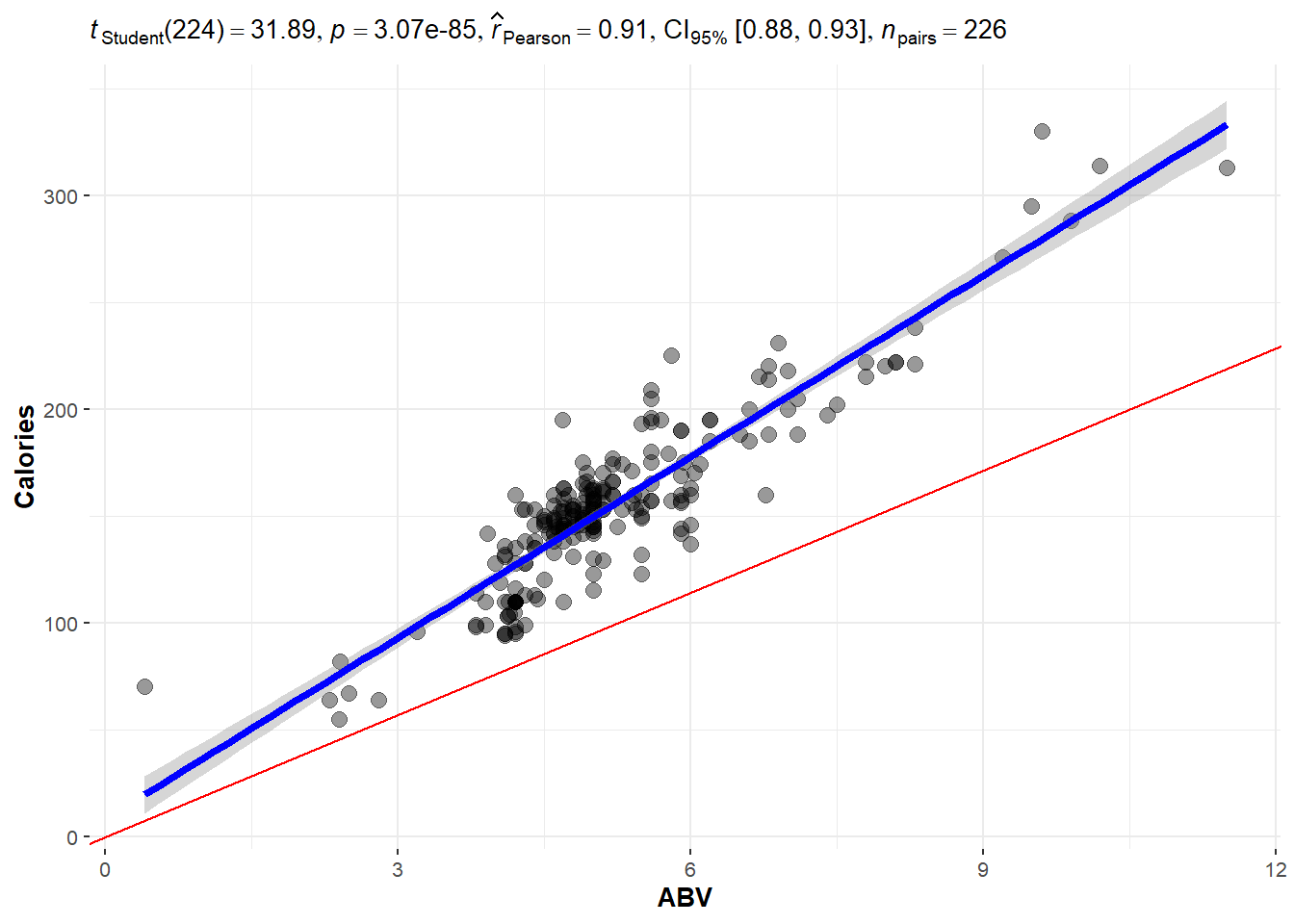
The blue line is the one we will learn how to make.
The line is meant to estimate the mean value of \(Y\):
\[\mu_{y|x} = \beta_0 + \beta_1 x\]
We have to figure out what values we should use for \(\beta_0\) and \(\beta_1\).
- \(\beta_0\) and \(\beta_1\) are the true and exact values for the intercept and slope of the line. These are unknown and are referred to as parameters of our model.
- We but ^ over the symbol for parameters to denote an estimate of the parameter.
- \(\hat \beta_0\) is our \(y\) intercept estimate.
- \(\hat \beta_i\) is our slope estimate.
- Our overall estimate for the line is \(\hat \mu_{y|x} = \hat\beta_0 + \hat\beta_i x\)
- Often we also write \(\hat y = \hat \beta_0 + \hat \beta_i x\).
Regardless, what approach(es) can we take to create \(good\) values for \(\hat\beta_0\) and \(\hat\beta_i\)?
3.2 Least Squares Regression Line
Here is a plot of the data with what is called the least squares regression line.
beerLm <- lm(Calories ~ ABV, beer)


ggplot(beer, aes(x = ABV, y = Calories)) + geom_point() + geom_smooth(method = "lm",
    se = FALSE) + geom_segment(aes(x = ABV, y = Calories, xend = ABV, yend = beerLm$fitted.values),
    alpha = 0.8, col = "royalblue3") + theme_bw()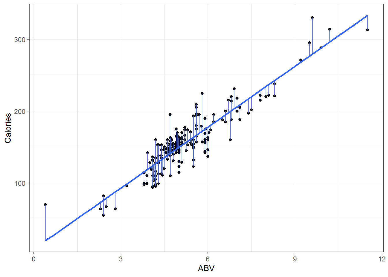
3.2.1 Measuring Error
- Sum of Squared Error
\[ SSE = \sum_{i=1}^n \left( y_i - \left(\hat \beta + \hat \beta x_i\right) \right)^2 = \sum_{i=1}^ne_i^2 \]
3.2.2 OLS solution (You can ignore this if you want.)
We want to find values of \(\hat \beta_0\) and \(\hat \beta_i\) that minimize the error sum of squares:
\[ \begin{aligned} SSE &= \sum (y - \hat{y})^2 \\ &=\sum_{i=1}^n \left( y_i - \left(\hat \beta_0 + \hat \beta_i x_i\right) \right)^2. \end{aligned} \]
To estimate to find \[ \frac{\partial}{\partial \hat \beta_i} SSE = \sum -2x(y - (\hat \beta_0 + \hat \beta_i)) = 0 \]
After substituting in our equation for \(\hat\beta_i\) above and doing quite a lot of algebra, we can make \(\hat\beta_i\) the subject.
\[ \begin{aligned} \hat\beta_i &= \frac{\sum xy - n \bar{x} \bar{y}}{\sum x^2 - n \bar{x}^2} \\ &= \frac{\sum{(x - \bar{x})(y - \bar{y})}}{\sum{(x-\bar{x})^2}} \end{aligned} \]
\[ \begin{aligned} \frac{\partial}{\partial \hat\beta_0} SSE &= \sum -2\left( y_i - \left(\hat \beta_0 + \hat \beta_i x_i\right) \right) = 0 \\ \sum \left( y_i - \left(\hat \beta_0 + \hat \beta_i x_i\right) \right) &= 0 \\ \sum y &= \sum\left( y_i - \left(\hat \beta_0 + \hat \beta_i x_i\right) \right) \\ \frac{\sum y}{n} &= \frac{\sum{\left(\hat \beta_0 + \hat \beta_i x_i\right)}}{n}\\ \bar{y} &= \hat \beta_0 + \hat \beta_i \bar{x} \end{aligned} \]
Substituting \(\bar{x}\) into the regression line gives \(\bar{y}\). In other words, the regression line goes through the point of averages.
3.2.3 Now you “know” the theory, lets look at what we do.
Okay, we’re using R. That function does regression for us? lm() !!!
Use ?lm to get a somewhat understandable summary that works pretty well once you learn how people screw up summarizing functions…
Any… Back to lm()
- there is a formula argument and a data argument. That’s all you need to know for now.
Let’s use it on that beers dataset and see what we get.
### Make an lm object

beers.lm <- lm(Calories ~ ABV, beer)

summary(beers.lm)
Call:
lm(formula = Calories ~ ABV, data = beer)

Residuals:
    Min      1Q  Median      3Q     Max
-40.738 -13.952   1.692  10.848  54.268

Coefficients:
            Estimate Std. Error t value Pr(>|t|)
(Intercept)   8.2464     4.7262   1.745   0.0824 .
ABV          28.2485     0.8857  31.893   <2e-16 ***
---
Signif. codes:  0 '***' 0.001 '**' 0.01 '*' 0.05 '.' 0.1 ' ' 1

Residual standard error: 17.48 on 224 degrees of freedom
Multiple R-squared:  0.8195,    Adjusted R-squared:  0.8187
F-statistic:  1017 on 1 and 224 DF,  p-value: < 2.2e-16
Our estimated regression line is:
\[\hat y = 8.2364 + 28.2485x\]
Or to write it as an estimated conditional mean.
\[\hat \mu_{y|x} = 8.2364 + 28.2485x\]
And that’s where we get this line:
ggplot(beer, aes(x = ABV, y = Calories)) + geom_point() + geom_smooth(method = "lm",
    se = TRUE)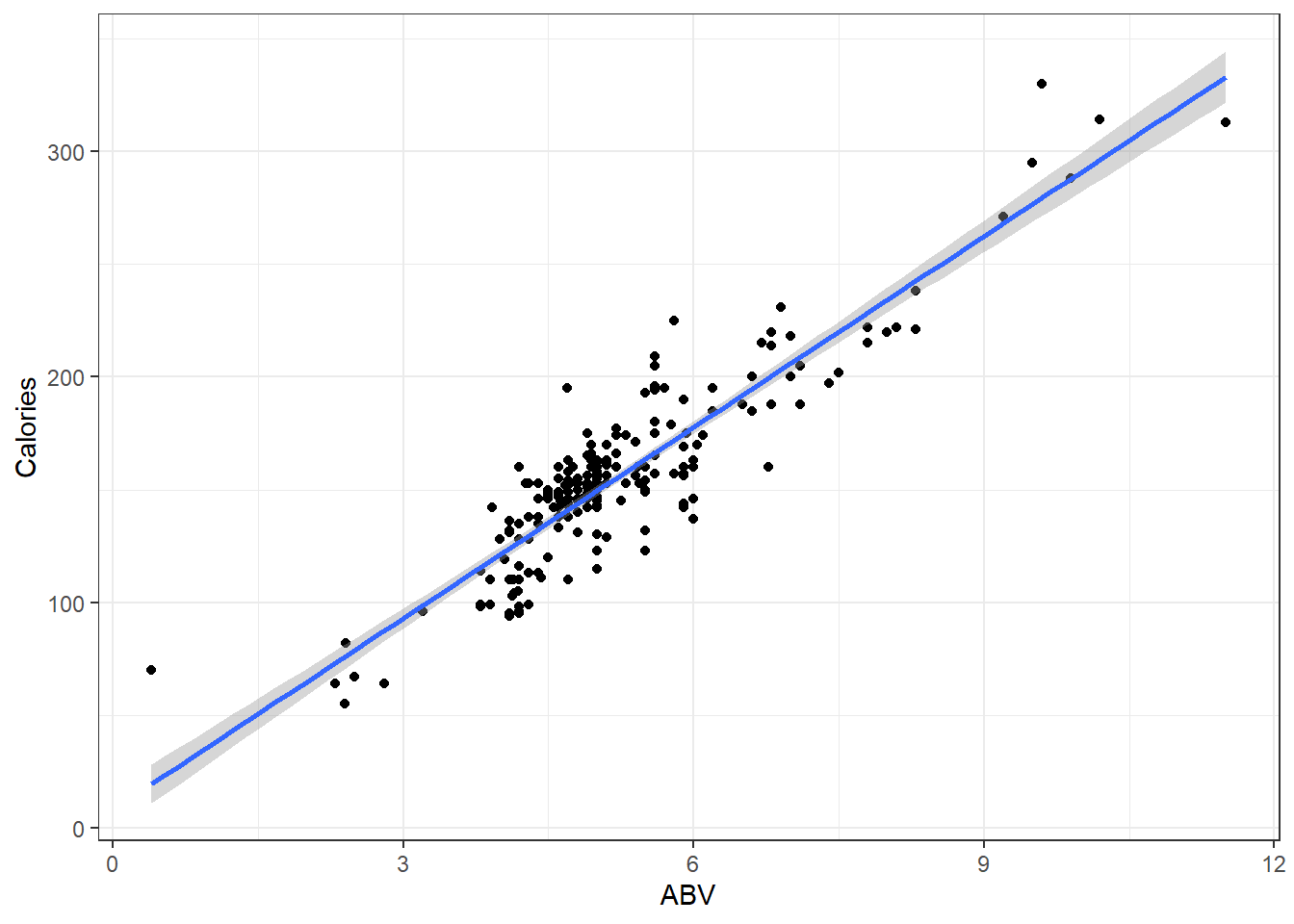
Additionally for the \(\epsilon \sim N(0, \sigma)\) term in the theoretical model,
Residual standard error: 17.48in our output tells us\(\hat \sigma = 17.48\) which means that at a given point on the line, we should expect the calorie content of individuals beers to fall above or below the line by about 17.48 calories.
3.2.4 Interpreting Coefficients
So we’ve got the slope estimate \(\hat \beta_i\) and we’ve got the intercept estimate \(\hat \beta_0\).
In general:
The slope tells us how much we expect the mean of our \(y\) variable to change when the \(x\) variable increases by 1 unit.
The intercept tells us what we would expect the mean value of \(y\) to be when the \(x\) variable is at 0 units.
Sometimes the intercept does not make sense.
- This is usually because \(x = 0\) is not within the range of our data.
- Or impossible.
- Or near the \(x=0\) range, the relationship between
For our data:
- The intercept of \(8.2464\) indicates that the model predicts that the mean calorie content of “beers” with 0% ABV is 8.2464 calories.
- There are some beers that are advertised as “non-alcoholic”.
- They have “negligble” amounts of alcohol but it is non-zero.
- Whether this is completely sensical or not depends on what you define as a beer.
- The slope of 28.2485 indicates that when we look at the mean calorie of beers, it should be 28.2485 calories higher of beers with a 1% higher ABV.
- This makes sense, i.e., alcohol has calories so more alcohol means more calories.
You always should look at your results and ask your self, “Does this make sense”?
- Usually the question of y-intercept making sense or not is not really a useful one.
- We need a y-intercept to have a line, and very often the data and what is reasonably observable does not include observations where \(x \approx 0\).
3.2.5 Prediction Using The Line
For our beers data, for beers with 5% ABV, we would expect an average calorie content of
\[\hat \mu_{y|x} = 8.2364 + 28.2485\cdot 5 \]
= 149.4789
Great, but what if you tell me you make beer at home and measure the ABV to be 5%.
- How many calories are in that specific Beer?
- We could say approximately 150 calories but that let’s not forget that we have an estimated error standard deviation of \(\hat \sigma = 17.48\) so it might be better to say the calorie content is some where in the 131.9989 to 166.9589 range (if we’re using a bunch of decimal places.)
- Honestly when doing casual intreptations it might be better to say \(150 \pm 20\) because its all about imprecision anyway.
3.2.6 Predict Function in R
Use the predict() function to get estimates for the mean which can be point estimates/predictions.
- The point of a regression model is estimate some sort model, and the method for doing so is called
predict. It works like so:
::: {.cell}
predict(lmModel, newdata):::
- Here
lmModelis an already estimated model, andnewdatais a dataset (referred to as data frame in R) containing the new cases, real or imaginary, for which we want to make predictions.
# Create a dataset for predicting average calories in beers with ABVs of 1%,
# 2%, 3%, ..., 10% R can create this vector easily with the `:` operator.
# `A:B` creates a vector that starts at A and goes up by 1 until it reaches
# (but does not exceed) B 1:10 represents the vector c(1, 2, 3, 4, 5, 6, 7, 8,
# 9, 10)

predictionData = data.frame(ABV = 1:10)


predict(beers.lm, newdata = predictionData)
1 2 3 4 5 6 7 8
36.49494 64.74349 92.99203 121.24058 149.48913 177.73768 205.98623 234.23478
9 10
262.48333 290.73188 - If you do not correctly specify the correct vector name in your
newdataargument, thenpredictwill simply give you the fitted \(\hat y\) values for each point in your data.
3.3 Statistcal Inference in Linear Regression
ggplot(beer, aes(x = ABV, y = Calories)) + geom_point() + geom_smooth(method = "lm",
    se = TRUE)
There’s bands around that line.
- This represents the fact that we don’t know the true regression line and are trying to account for how imprecise our estimate is.
- It displays a continuum for plausible values of the true line \(\hat \mu_{y|x}\) based on our sample data.
3.3.1 Example
Let’s look at what happens when the true model is \(Y = 300 - 5x + \epsilon\) when \(\epsilon \sim N(0, 20)\) and we take a sample of 50 individuals.
- The sample observations will be plotted in blue.
- The estimated regression line from those observations will be red.
- The true line will be in black.
n = 50

set.seed(11)

# Need x values
dat <- data.frame(x = rnorm(n, 33, 5))  #n, mu, sigma

# need a value for coefficients.
B <- c(300, -5)  # don't forget the y-intercept.

# Deterministic portion
dat$mu_y <- B[1] + B[2] * dat$x

# Introducing error
dat$err <- rnorm(n, 0, 20)

dat$y <- dat$mu_y + dat$err

ggplot(dat, aes(x = x, y = y)) + geom_point(data = dat, mapping = aes(x = x, y = y),
    col = "blue") + geom_smooth(method = "lm", col = "red") + geom_abline(intercept = B[1],
    slope = B[2], col = "black") + theme_bw()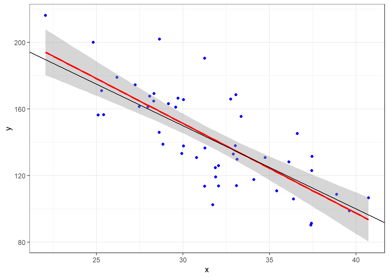
Given that we have sample data, we can’t expect our line to be the true line.
This is because there is variability associated with our slope estimate and variability associated with our intercept estimate.
3.3.2 Tests for the Line Coefficients
The \(\hat \beta\)’s are referred to as coefficients.
When you see the output for the summary of our lm, draw your attention to this part of the output.
    Coefficients:
            Estimate Std. Error t value Pr(>|t|)
(Intercept)   8.2464     4.7262   1.745   0.0824 .
ABV          28.2485     0.8857  31.893   <2e-16 ***
We are seeing various pieces of information. From left to right:
- We point estimates for the \(\hat beta\)’s.
- We are given standard errors for those estimates.
- We are given test statistics foir some hypothesis test (what is it)?
- We are given the p-value for that test.
The hypothesis test is this:
\[H_0: \beta_i = 0\] \[H_1: \beta_i \ne 0\]
The test statistic is:
\[t = \frac{\hat \beta_i}{SE_{\hat \beta_i}}\]
We simple divide our coefficient estimate by its standard error.
The test statistic is assumed to be from a \(t\) distribution with degrees of freedom \(df = n -2\).
For the y-intercept, we get a p-value of 0.0824:
- Our conclusion would be that there is moderate evidence that there is a true y-intercept in the model.
- Inference on the y-intercept is considered not important usually.
For the slope the p-value is approximately 0:
- Conclusion: There is extremely strong evidence of a linear component that relates ABV with calories.
- This is usually what we are concerned with.
3.3.3 Confidence Intervals
We can likewise get confidence intervals for the coefficients. They take the general form:
\[\hat \beta_i \pm t_{\alpha/2, \space n-2} \cdot SE_{\hat \beta_i}\]
Again the \(t_{\alpha/2}\) quantile depends on the value for \(\alpha\) of the desired nominal confidence level \(1 - \alpha\).
To get the confidence intervals we use the confint() function.
confint(beers.lm, level = 0.99) 0.5 % 99.5 %
(Intercept) -4.031982 20.52476
ABV 25.947491 30.54961Our interval indicates statistically plausible (which means disregarding context) levels for a y-intercept of the true line is between -4.03 and 20.52 with 99% confidence.
And plausible values for the increase in calories when beers have 1% higher ABV is between 25.95 and 30.55 with 99% confidence.
Do these CIs indicate any compatibility with the line for the theoretical line that computes (exactly) the amount of calories in a can of water with percentage of pure ethanol by volume?
\[f(x) = 19.05x\]
3.4 Inference on the Regression Line
# Fun fact. If you put the dataset in the same folder as the Rmd/qmd file you
# are working in. Then you only need the filename to load it. Not the whole
# file path on your computer.  I prefer to use the here package to resolve
# local path issues

heart <- readr::read_csv(here::here("datasets", "Heart.csv"))ggplot(heart, aes(x = age, y = maxHR, color = disease)) + geom_point() + geom_smooth(method = "lm",
se = FALSE) + facet_wrap(~disease) + stat_cor()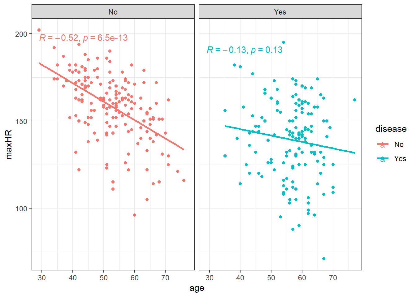
We can filter() the data and only examine individuals without heart disease since the relation doesn’t appear viable in those with heart disease.
noDisease <- filter(heart, disease == "No")ggplot(noDisease, aes(x = age, y = maxHR)) + geom_point() + geom_smooth(method = "lm",
se = FALSE)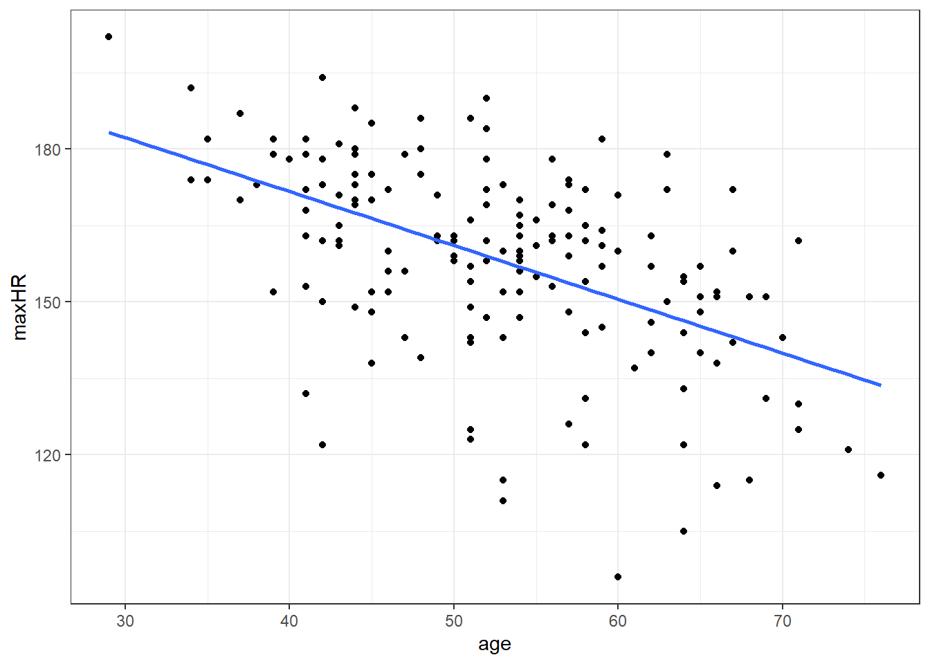
Anyway, there’s a line let’s see what the equation for it is.
# nD is short for no Disease
nD.lm <- lm(maxHR ~ age, noDisease)

nD.lm.sum <- summary(nD.lm)

nD.lm.sum
Call:
lm(formula = maxHR ~ age, data = noDisease)

Residuals:
    Min      1Q  Median      3Q     Max
-54.545  -7.782   2.524  10.004  31.624

Coefficients:
            Estimate Std. Error t value Pr(>|t|)
(Intercept) 213.9282     7.2204  29.628  < 2e-16 ***
age          -1.0564     0.1351  -7.818 6.47e-13 ***
---
Signif. codes:  0 '***' 0.001 '**' 0.01 '*' 0.05 '.' 0.1 ' ' 1

Residual standard error: 16.41 on 162 degrees of freedom
Multiple R-squared:  0.2739,    Adjusted R-squared:  0.2694
F-statistic: 61.12 on 1 and 162 DF,  p-value: 6.469e-13
So the equation to our line would be:
\(\widehat maxHR = 213.9 - 1.06 \cdot age\)
3.4.0.1 Confidence Intervals for Coefficients
confint(nD.lm, level = 0.99) 0.5 % 99.5 %
(Intercept) 195.108145 232.7482574
age -1.408595 -0.7041663
3.5 Uncertainty in the Model
\[y = \beta_0 + \beta_1x + \epsilon_{error}\]
\[\epsilon \sim N(\theta, \sigma_\epsilon)\]
The \(\epsilon\) representing the inherent variability we would expect from individual observations.
3.6 Partitioning Variability
At this point, we will be examining data for those without heart disease only, unless mentioned otherwise.
\[\hat y = \widehat \mu_{y|x} = \widehat\beta_0 + \widehat\beta_1 x\]
3.6.1 Sums of Squares
\[SSTO = \Sigma_{i=1}^n (y_i - \bar y)^2\]
\[ s^2_y = \frac{SSTO}{n-1} \]
This variability in the variable can be broken up into two pieces:
- The Sum of Squares of Regression \(SSR\).
\[SSR = \Sigma(\hat y - \bar y)^2\]
- The Sum of Squared Error \(SSE\).
\(SSE = \Sigma (y_i - \hat y_i)^2\)
The two sums of squares combined are the total variability \(SSTO\).
\(SSTO = SSR + SSE\)
3.6.2 Coefficient of Determination \(R^2\)
\(R^2 = \frac{SSR}{SSTO} = \frac{Explained}{Total}\)
which is the ratio of how much of the total variability in our data that is “explained” by our model.
Often the form of \(R^2\) is written as
\(R^2 = 1- \frac{SSE}{SSTO}\)
3.6.2.1 Interpreting \(R^2\)
“The regression model is accounting for <\(R^2\cdot 100\)>% of the variability in <the response variable.”
nD.lm.sum
Call:
lm(formula = maxHR ~ age, data = noDisease)

Residuals:
    Min      1Q  Median      3Q     Max
-54.545  -7.782   2.524  10.004  31.624

Coefficients:
            Estimate Std. Error t value Pr(>|t|)
(Intercept) 213.9282     7.2204  29.628  < 2e-16 ***
age          -1.0564     0.1351  -7.818 6.47e-13 ***
---
Signif. codes:  0 '***' 0.001 '**' 0.01 '*' 0.05 '.' 0.1 ' ' 1

Residual standard error: 16.41 on 162 degrees of freedom
Multiple R-squared:  0.2739,    Adjusted R-squared:  0.2694
F-statistic: 61.12 on 1 and 162 DF,  p-value: 6.469e-13
Regardless of how we get it, an interpretation of the model would be “using a linear model, age accounts for approximately 27% of the variability in maximum heart rate”.
3.7 Effect Sizes
We’ve now seen two different numbers that describe our nD.lm model: a slope of about \(-1.06\) beats-per-minute per year, and an \(R^2\) of about \(0.27\). It is worth pausing to name the concept that ties these together. Both of them are effect sizes.
An effect size is simply a quantitative measure of the magnitude (or strength) of a phenomenon. It answers a different question than the p-value:
The p-value (and the hypothesis test) approximately answers “is there an effect?” — i.e., is the signal distinguishable from noise?
The effect size answers “how big is the effect?”
These two questions are complementary. With a large enough sample, a trivially small effect can have a tiny p-value (it is “statistically significant” but practically meaningless), and with a small sample a large, important effect can fail to reach significance. Reporting an effect size — ideally with a confidence interval — forces us to talk about how much rather than just whether.
Effect sizes in regression come in two broad flavors:
Unstandardized effect sizes, expressed in the original units of the data (e.g., the slope). This is generally the preferred metric.
Standardized effect sizes, which are unitless and (in principle) and are often considered (but rarely ever verified) to be comparable across variables and studies (e.g., a standardized coefficient or \(R^2\)).
3.7.1 The slope as an effect size
The most direct effect size in a simple linear regression is the slope, \(\hat \beta_1\), itself. It is a measure of the magnitude of the relationship, expressed in real-world units:
For the beers, \(\hat \beta_1 = 28.25\) means an increase of about 28 calories for every 1% increase in ABV.
For the heart data, \(\hat \beta_1 = -1.06\) means a decrease of about 1 beat-per-minute in maximum heart rate for each additional year of age.
The big advantage of the raw slope is that it is directly interpretable — calories and beats-per-minute are quantities people understand.
Its limitation is that it is scale-dependent:
You cannot directly compare a slope measured in \(\text{calories} / \%\text{ABV}\) to one measured in \(\text{bpm} / \text{year}\) — the units are different.
The number itself changes if you rescale the predictor. If we had recorded ABV as a proportion (0.05) instead of a percent (5), the slope would become \(2824.85\) even though nothing about the underlying relationship changed.
Standardizing the coefficients tries to aide the interpretation… but I have my doubts.
3.7.2 Standardized coefficients
The idea behind a standardized coefficient is to put the slope on a common, unitless scale by expressing both \(x\) and \(y\) in standard-deviation units (i.e., as \(z\)-scores). The standardized slope \(\hat \beta_1^{*}\) then tells us:
“For a one-standard-deviation increase in \(x\), the mean of \(y\) changes by \(\hat \beta_1^{*}\) standard deviations.”
Mechanically, you can get there two equivalent ways. The first is to literally re-fit the model on the \(z\)-scored variables. The second is to rescale the slope you already have by the ratio of the standard deviations:
\[\hat \beta_1^{*} = \hat \beta_1 \cdot \frac{s_x}{s_y}\]
Let’s do it by hand for the heart model and confirm it matches:
# manual standardization of the age slope
coef(nD.lm)["age"] * sd(noDisease$age) / sd(noDisease$maxHR)
age
-0.5233712
Rather than scaling by hand, the parameters package (part of the easystats family, like performance) will do this for us with model_parameters(). The standardize = "refit" argument re-fits the model on standardized data:
model_parameters(nD.lm, standardize = "refit")Parameter | Coefficient | SE | 95% CI | t(162) | p
----------------------------------------------------------------------
(Intercept) | -1.69e-16 | 0.07 | [-0.13, 0.13] | -2.53e-15 | > .999
age | -0.52 | 0.07 | [-0.66, -0.39] | -7.82 | < .001There are other methods available (e.g. standardize = "basic" or "posthoc"), which differ mainly in how they handle more complex models; for a simple regression they all give essentially the same answer.
3.7.2.1 A useful identity
For a simple linear regression (one predictor), the standardized slope is exactly the Pearson correlation coefficient, \(r\). And because \(R^2\) for a simple regression is just \(r^2\), all of these numbers are different views of the same quantity:
# the standardized slope equals the correlation...
cor(noDisease$age, noDisease$maxHR)
[1] -0.5233712# ...and its square equals R^2
cor(noDisease$age, noDisease$maxHR)^2[1] 0.2739174So our heart model has a standardized slope of \(r \approx -0.52\), and \((-0.52)^2 \approx 0.27 = R^2\). This is the same \(0.27\) we interpreted in the \(R^2\) section above — it was an effect size all along.
The contrast with the beers is instructive. That relationship is much stronger:
model_parameters(beers.lm, standardize = "refit")Parameter | Coefficient | SE | 95% CI | t(224) | p
---------------------------------------------------------------------
(Intercept) | -1.15e-16 | 0.03 | [-0.06, 0.06] | -4.07e-15 | > .999
ABV | 0.91 | 0.03 | [ 0.85, 0.96] | 31.89 | < .001Here the standardized slope is about \(0.91\) (so \(R^2 \approx 0.82\)): a one-SD increase in ABV is associated with nearly a full-SD increase in calories.
3.7.2.2 Is standardizing a good idea?
Standardized coefficients are useful, but they are easy to over-trust. The trade-offs:
Arguments for:
They make coefficients comparable when raw units are arbitrary or hard to interpret (survey scales, indices, etc.).
In multiple regression (next module), they let you compare the relative contribution of predictors measured on very different scales.
Arguments against:
A standardized effect is tied to the standard deviations of your sample. Two studies with the same true relationship but different ranges of \(x\) will report different standardized slopes, so they are not as “transportable” as people assume.
Standardizing a binary or categorical predictor (a 0/1 dummy variable) is usually meaningless — a “one standard deviation change” in a yes/no variable has no natural interpretation.
Standardizing throws away the interpretable units. “28 calories per 1% ABV” is more concrete and more useful to a reader than “0.91 standard deviations.”
It is tempting to drop the standardized value onto Cohen’s “small / medium / large” benchmarks (e.g., \(r\) of \(0.1\) / \(0.3\) / \(0.5\)). These thresholds are arbitrary conventions, were never meant to be universal, and can be badly misleading in a specific scientific context.
A reasonable default: report the raw slope (with its confidence interval) as your primary effect size, and use standardized coefficients as a secondary, comparison-oriented summary — not as the headline result.
3.7.3 \(R^2\) as an effect size
This brings us back to \(R^2\). We introduced it as the proportion of variability “explained” by the model, but it is worth stating plainly that \(R^2\) is itself an effect size — it belongs to the variance-explained family (alongside measures like \(\eta^2\) and Cohen’s \(f^2\) that you may meet later).
We’ve already seen that for simple regression \(R^2 = r^2\), i.e., it is the square of the standardized slope. So the slope, the standardized slope (correlation), and \(R^2\) are not three unrelated outputs — they are three lenses on the same underlying relationship strength:
the slope describes the effect in real units,
the standardized slope (\(r\)) describes it in standard-deviation units, and
\(R^2\) describes how much of the variability that relationship accounts for.
The same caution about benchmarks applies: an \(R^2\) of \(0.27\) is not automatically “weak” and an \(R^2\) of \(0.82\) is not automatically “good.” What counts as a meaningful effect size always depends on the science and the context.
3.8 Analysis of Variance (ANOVA) in Regression
In simple linear regression we discussed the hypothesis test for the slope (and intercept).
\[H_0: \beta_1 = 0\]
- Essentially, null hypothesis posits that x variable is useless as predictor of y
\[H_1: \beta_1 \neq 0\]
In essence we are testing to see if the \(x\) variable is a worthwhile predictor.
This test was done via the test statistic \[t = \frac{\hat \beta_1}{SE_{\hat \beta_1}}.\]
The \(t\) distribution with \(n-2\) degrees of freedom is used to compute the \(p\)-value for this hypothesis test.
3.8.1 Degrees of Freedom
\(SSR\) has 1 degree of freedom.
\(SSE\) has \(n-2\) degrees of freedom.
Overall, \(SSTO\) has \(n-1\) degrees of freedom.
3.8.2 Mean Squares and the Test Statistic
However, in regression analysis, we are mainly interested in the mean square of regression \(MSR\) and mean squared error.
A mean square is the sum of square divided by its degrees of freedom.
- \(MSR = \frac{SSR}{1}\)
- \(MSE = SSE \div (n-2)\)
We take their ratio, which is our new test statistic.
\(F_t = \frac{MSR}{MSE} = \frac{SSR}{1} \div \frac{SSE}{n-2}\)
F-test under \(H_0\)
\[ H_0 \rightarrow F_t \sim F(1,n-2) \]
3.8.3 F-Distribution
The \(p\)-value is the probability of a random value from an \(F(1, n-2)\) distribution exceeding the test statistic: \(p = P\left(F(1, n-2) > F_t\right)\).
library(ggdist)
library(distributional)

dist_df = data.frame(
  d = dist_f(1,18)
)

dist_df %>%
  ggplot(aes(xdist = d)) +
  stat_slab(color = "grey", expand = TRUE,
            aes(fill = after_stat(level)),
            .width = c(.95,1))+
  stat_spike(at = function(x) hdci(x, .width = .975),
             linetype = "dashed")+
  # need shared thickness scale so that stat_slab and geom_spike line up
  scale_thickness_shared() +
  theme_void() +
    scale_fill_brewer(na.value = "gray95") +
  labs(fill = "Rejection Region on F-distribution",
       caption = "F distribution with 1 and 18 degrees of freedom") +
  theme(legend.position = "none")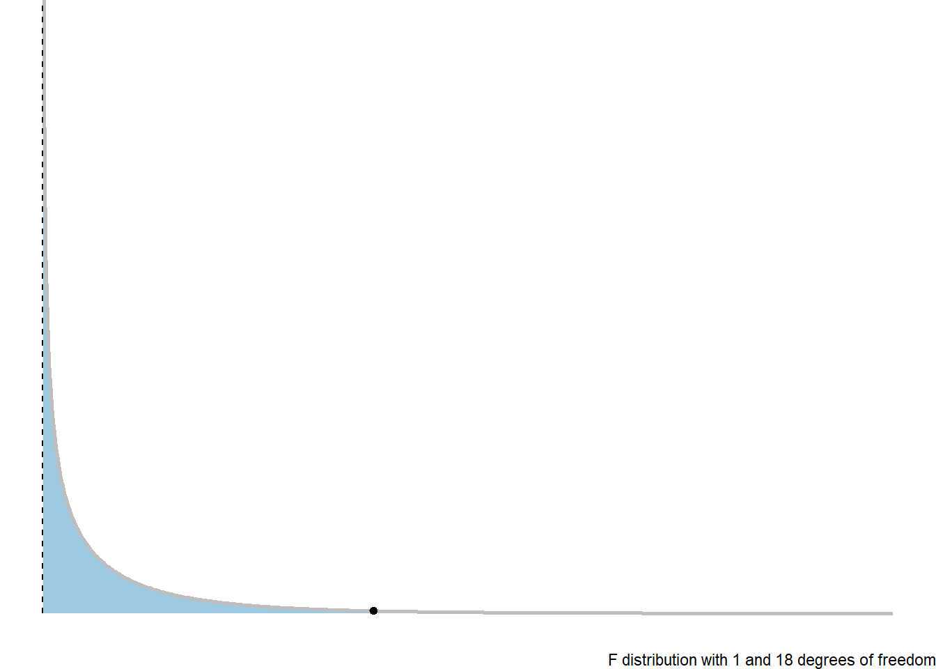
3.8.4 ANOVA Table
We would in general summarise a Analysis of Variance based hypothesis test with the following ANOVA table.
| Source of Variability | Sum of Squares | df | MS | F | p-value |
|---|---|---|---|---|---|
| Regression/Model | \(SSR\) | \(1\) | \(MSR = SSR/1\) | \(F_t = MSR/MSE\) | \(p\) |
| Error | \(SSE\) | \(n-2\) | \(SSE/(n-2)\) | ||
| Total | \(SSTO\) | \(n-1\) |
3.8.5 Regression ANOVA in R
The ANOVA hypothesis test information is shown in the last row of the summary of an lm.
nD.lm.sum
Call:
lm(formula = maxHR ~ age, data = noDisease)

Residuals:
    Min      1Q  Median      3Q     Max
-54.545  -7.782   2.524  10.004  31.624

Coefficients:
            Estimate Std. Error t value Pr(>|t|)
(Intercept) 213.9282     7.2204  29.628  < 2e-16 ***
age          -1.0564     0.1351  -7.818 6.47e-13 ***
---
Signif. codes:  0 '***' 0.001 '**' 0.01 '*' 0.05 '.' 0.1 ' ' 1

Residual standard error: 16.41 on 162 degrees of freedom
Multiple R-squared:  0.2739,    Adjusted R-squared:  0.2694
F-statistic: 61.12 on 1 and 162 DF, p-value: 6.469e-13anova(nD.lm)Analysis of Variance Table
Response: maxHR
Df Sum Sq Mean Sq F value Pr(>F)
age 1 16458 16457.7 61.115 6.469e-13 ***
Residuals 162 43625 269.3
---
Signif. codes: 0 '***' 0.001 '**' 0.01 '*' 0.05 '.' 0.1 ' ' 13.9 Model Error: \(\sigma_\epsilon\)
This is the linear model for each value \(y\) value in a random sample:
\(y_i = \beta_0 + \beta_1 x_i + \epsilon_i\)
Where of particular note, we have
variability:
\[\epsilon_i \sim N(0, \sigma_\epsilon)\]
\[\hat \sigma_\epsilon= \sqrt{MSE}\]
3.9.1 Standard Error of \(\hat \beta_1\) and \(\widehat \beta_0\)
\[SE_{\beta_0}= \hat \sigma_{\epsilon}\sqrt{\dfrac{1}{n} + \dfrac{\overline x^2}{\sum(x_i - \overline x)^2}}\]
\[SE_{\beta_1} = \hat \sigma_{\epsilon}\sqrt{\dfrac{1}{\sum(x_i - \overline x)^2}}\]
3.9.2 Standard Error for the Line
We use the equation
\[\hat y= \hat \mu_{y|x} = \beta_0 + \beta_1 x\]
How uncertain are we estimating the mean, or making predictions?
3.9.2.1 Estimated Conditional Mean
When estimating \(\mu_{y|x}\) at a given value of \(x\), the standard error is:
\[SE_{\hat \mu_{y|x}} = \hat \sigma_{\epsilon} \sqrt{\dfrac{1}{n} + \dfrac{(x-\overline x)^2}{\sum(x_i - \overline x)^2}}\]
This is the counterpart to what you did in your introductory course when just estimating the mean of \(y\) (\(\mu\)) without considering an \(x\) variable.
\[SE_{\bar y }= \frac{s}{\sqrt{n}}\]
3.9.2.2 Standard Error of Predictions
\[SE_{pred} = \hat \sigma_{\epsilon} \sqrt{1 + \dfrac{1}{n} + \dfrac{(x-\overline x)^2}{\sum(x_i - \overline x)^2}}\]
3.9.3 Confidence Intervals for the Mean
We can use our data and compute an estimated value for the line:
\[\hat \mu_{y|x} = \beta_0 + \beta_1 x\]
We can create confidence intervals for this estimate using the \(t\)-distributiuon with \(n-2\) degrees of freedom.
\[\hat \mu_{y|x} + t_{\alpha/2,df} \cdot SE_{\hat \mu_{y|x}}= \hat \mu_{y|x} \pm t_{\alpha/2, n-2} \hat \sigma_{\epsilon} \sqrt{\dfrac{1}{n} + \dfrac{(x-\overline x)^2}{\sum(x_i - \overline x)^2}}\]
This interval tells us that we can be \((1-\alpha)100\%\) confident that the true line at a given point \(x\) is between the lower and upper bound.
3.9.4 Prediction Intervals for Future Observations
In a similar manner, we can create confidence intervals that will let us be \((1-\alpha)100\%\) confident that a future observation will be between
\[\widehat y \pm t_{\alpha/2, n-2} SE_{pred} = \hat y \pm t_{\alpha/2, n-2} \hat \sigma_{\epsilon} \sqrt{1 + \dfrac{1}{n} + \dfrac{(x-\overline x)^2}{\sum(x_i - \overline x)^2}}\]
3.9.5 Getting Confidence and Prediction Intervals in R
For confidence and prediction intervals, we can use the predict(). The arguments we need to define are interval and level.
intervalcan be set to “none”, “confidence”, and “prediction” for no interval, a confidence interval for the mean, and a future observation prediction interval, respectivelylevelis simply the confidence level of your interval. The default is 0.95.
# need the data for predictions

predData <- data.frame(age = c(20, 30, 40, 50, 60, 70, 80))

confIntervals <- predict(nD.lm, newdata = predData, interval = "confidence", level = 0.99)
predIntervals <- predict(nD.lm, newdata = predData, interval = "prediction", level = 0.99)
Confidence Intervals:
confIntervals fit lwr upr
1 192.8006 180.8474 204.7537
2 182.2368 173.6092 190.8644
3 171.6730 166.1228 177.2232
4 161.1092 157.6473 164.5711
5 150.5454 146.3056 154.7852
6 139.9816 132.9975 146.9657
7 129.4178 119.2006 139.6349Prediction Intervals:
predIntervals fit lwr upr
1 192.8006 148.38873 237.2125
2 182.2368 138.60227 225.8713
3 171.6730 128.54132 214.8046
4 161.1092 118.19624 204.0221
5 150.5454 107.56269 193.5281
6 139.9816 96.64206 183.3211
7 129.4178 85.44134 173.39423.9.6 Graph of Confidence Intervals and Prediction Intervals
# without giving predict() new data, you get predictions for ALL points in the
# data
predictions <- predict(nD.lm, interval = "prediction", level = 0.99)

# combin prediction intervals with dataset
allData <- cbind(noDisease, predictions)

# graph define x and y axis variables
ggplot(allData, aes(x = age, y = maxHR)) + #add scatterplot points ggplot(allData,
ggplot(allData, aes(x = age, y = maxHR)) + #add scatterplot points aes(x = age,
ggplot(allData, aes(x = age, y = maxHR)) + #add scatterplot points y = maxHR))
ggplot(allData, aes(x = age, y = maxHR)) + #add scatterplot points + #add
ggplot(allData, aes(x = age, y = maxHR)) + #add scatterplot points scatterplot
ggplot(allData, aes(x = age, y = maxHR)) + #add scatterplot points points
geom_point() + #confidence bands geom_point() + #confidence bands
stat_smooth(method = lm, level = 0.99) + #lwr pred interval stat_smooth(method
stat_smooth(method = lm, level = 0.99) + #lwr pred interval = lm, level = 0.99)
stat_smooth(method = lm, level = 0.99) + #lwr pred interval + #lwr pred
stat_smooth(method = lm, level = 0.99) + #lwr pred interval interval
geom_line(aes(y = lwr), col = "red", linetype = "dashed") + #upr pred interval geom_line(aes(y
geom_line(aes(y = lwr), col = "red", linetype = "dashed") + #upr pred interval =
geom_line(aes(y = lwr), col = "red", linetype = "dashed") + #upr pred interval lwr),
geom_line(aes(y = lwr), col = "red", linetype = "dashed") + #upr pred interval col
geom_line(aes(y = lwr), col = "red", linetype = "dashed") + #upr pred interval =
geom_line(aes(y = lwr), col = "red", linetype = "dashed") + #upr pred interval "red",
geom_line(aes(y = lwr), col = "red", linetype = "dashed") + #upr pred interval linetype
geom_line(aes(y = lwr), col = "red", linetype = "dashed") + #upr pred interval =
geom_line(aes(y = lwr), col = "red", linetype = "dashed") + #upr pred interval "dashed")
geom_line(aes(y = lwr), col = "red", linetype = "dashed") + #upr pred interval +
geom_line(aes(y = lwr), col = "red", linetype = "dashed") + #upr pred interval #upr
geom_line(aes(y = lwr), col = "red", linetype = "dashed") + #upr pred interval pred
geom_line(aes(y = lwr), col = "red", linetype = "dashed") + #upr pred interval interval
geom_line(aes(y = upr), col = "red", linetype = "dashed")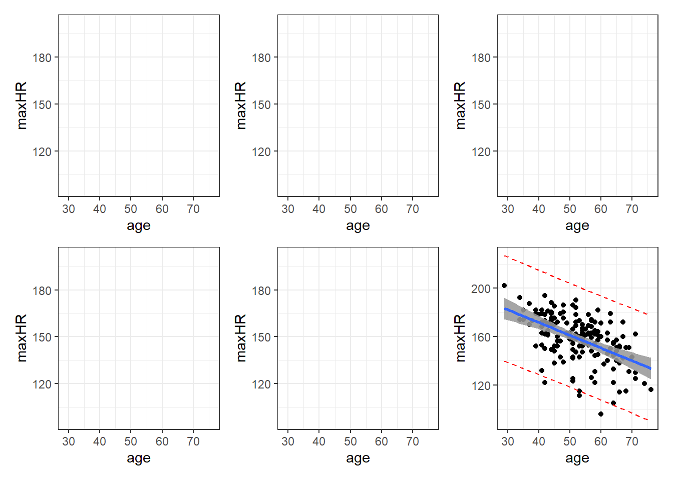
Blue is estimated line, gray is possibilities for true line, and red is a range possible future observations.
3.9.7 Important Note: Confidence Levels and Their Reliability.
The confidence level for a confidence/prediction interval only applies to that individual interval.
3.10 Working-Hotelling Confidence:
The calculation of confidence and prediction bands if fairly simple. You just have to replace the critical \(t\) value used to create the confidence and prediction interval. This replacement is based off of a modification of values from the F-Distribution.
This value will be referred to is as \(W_\alpha\). It requires a value from the \(F\) distribution with 2 degrees of freedom for the numerator, and \(n - 2\) for the denominator. This value on the \(F\) distribution is such that it has a left-tail area/probability of \(1-\alpha\).
\[ W_\alpha = \sqrt{2\cdot F(1-\alpha, 2, n-2)}\]
3.10.1 Working-Hotelling Confidence Bands
To compute the confidence bands, the formula is:
\[\widehat y \pm t_{\alpha/2, n-2} \cdot SE_{pred} = \hat y \pm W_\alpha \space \sqrt{1 + \dfrac{1}{n} + \dfrac{(x-\overline x)^2}{\sum(x_i - \overline x)^2}}\]
3.10.2 Working-Hotelling Prediction Bands Bands
Similarly for the prediction intervals.
\[\widehat y \pm t_{\alpha/2, n-2} SE_{pred} = \hat y \pm W_\alpha \hat \sigma_{\epsilon} \sqrt{1 + \dfrac{1}{n} + \dfrac{(x-\overline x)^2}{\sum(x_i - \overline x)^2}}\]
3.10.3 Getting These in R
Apparently I need to make my own R functions for this.
working_hotelling_intervals <- function(x, y) {
  y <- as.matrix(y)
  x <- as.matrix(x)
  n <- length(y)

  # Get the fitted values of the linear model
  fit <- lm(y ~ x)
  fit <- fit$fitted.values

  # Find standard error as defined above
  se <- sqrt(sum((y - fit)^2) / (n - 2)) *
    sqrt(1 / n + (x - mean(x))^2 /
           sum((x - mean(x))^2))

  # Calculate B and W statistics for both procedures.
  W <- sqrt(2 * qf(p = 0.95, df1 = 2, df2 = n - 2))
  B <- 1-qt(.95/(2 * 3), n - 1)

  # Compute the simultaneous confidence intervals

  # Working-Hotelling
  wh.upper <- fit + W * se
  wh.lower <- fit - W * se

  xy <- data.frame(cbind(x,y))

  # Plot the Working-Hotelling intervals
  wh <- ggplot(xy, aes(x=x, y=y)) +
    geom_point(size=2.5) +
    geom_line(aes(y=fit, x=x), size=1) +
    geom_line(aes(x=x, y=wh.upper),
              colour='blue', linetype='dashed') +
    geom_line(aes(x=x, wh.lower),
              colour='blue', linetype='dashed') +
    labs(title='Working-Hotelling')


  return(wh)
}

working_hotelling_intervals(x = noDisease$age, y = noDisease$maxHR)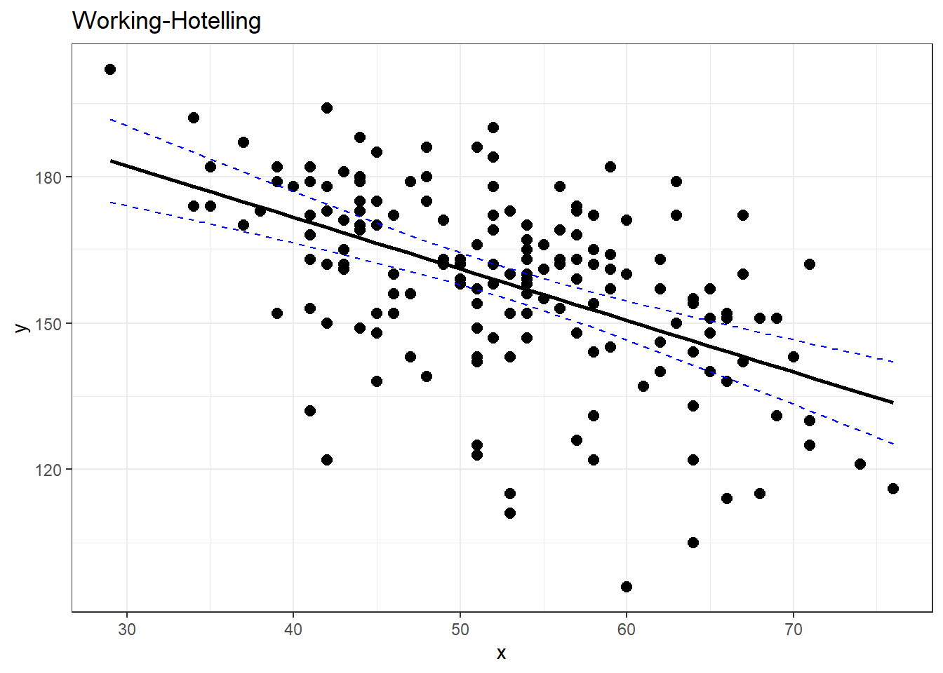
# compare with ggplot
#
ggplot(noDisease,
       aes(x=age,
           y=maxHR)) +
  geom_point(alpha = .5) +
  geom_smooth(method = "lm",
              formula = y~x,
              se = TRUE)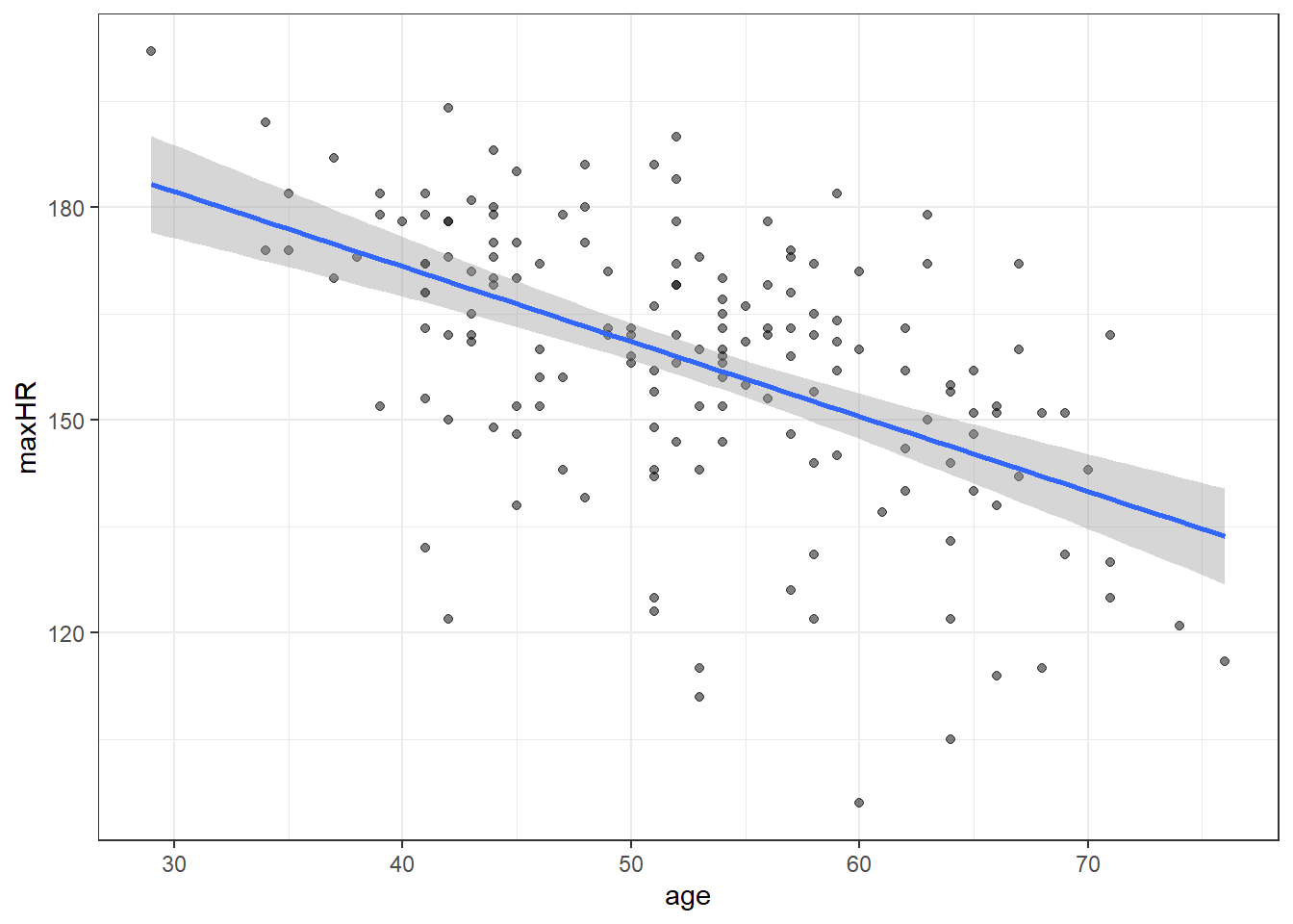
3.11 Residual Diagnostics
We will expand on these regression topics some when we move on to multiple regression.
Here are some code chunks that setup this document.
beer <- read.csv(here::here("datasets",
                            "beer.csv"))

beers.lm <- lm(Calories ~ ABV, beer)
3.12 Validating the Model and Statistical Inference: The Residuals
\[y = \beta_0 + \beta_1 x + \epsilon\]
\(\epsilon \sim N(0,\sigma)\)
There are assumptions that this model implies:
The error terms are normally distributed.
The error terms for all observation have a mean of zero which implies the model is unbiased,i.e, there is truly and only a linear relationship between \(x\) and \(y\).
The error terms have the same/constant standard deviation/variability that does not depend on where we look at along the line. This is referred to as homogeneity of variance.
A required assumption is that the error terms of the observations are all independent of each other.
ggplot(beer,
       aes(x=ABV,y=Calories)) + geom_point() +
  geom_smooth(method = "lm",
              formula = y~x)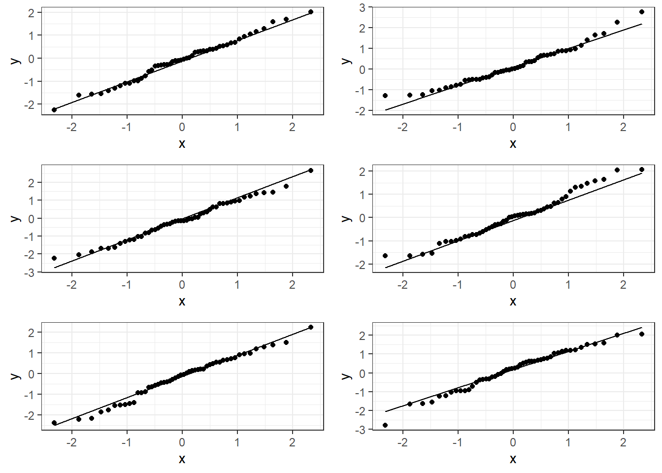
3.13 Residuals
We estimate the error using what are referred to as residuals:
\[e_i = y_i - \hat y_i = y_i - (\beta_0 + \beta_i x_i)\]
- \(y_i\) is observed value of y
- \(\hat y_i\) is “fitted” value of y
summary(beers.lm)
Call:
lm(formula = Calories ~ ABV, data = beer)

Residuals:
    Min      1Q  Median      3Q     Max
-40.738 -13.952   1.692  10.848  54.268

Coefficients:
            Estimate Std. Error t value Pr(>|t|)
(Intercept)   8.2464     4.7262   1.745   0.0824 .
ABV          28.2485     0.8857  31.893   <2e-16 ***
---
Signif. codes:  0 '***' 0.001 '**' 0.01 '*' 0.05 '.' 0.1 ' ' 1

Residual standard error: 17.48 on 224 degrees of freedom
Multiple R-squared:  0.8195,    Adjusted R-squared:  0.8187
F-statistic:  1017 on 1 and 224 DF,  p-value: < 2.2e-16
3.14 Checking Normality
You can use beers.lm in ggplot(). Use .resid for the variable you want to graph.
# The histogram function needs you
# to tell it how many bins you want.

ggplot(beers.lm, aes(x = .resid)) +
  geom_histogram(bins = 15,
                 color = "black", fill = "white")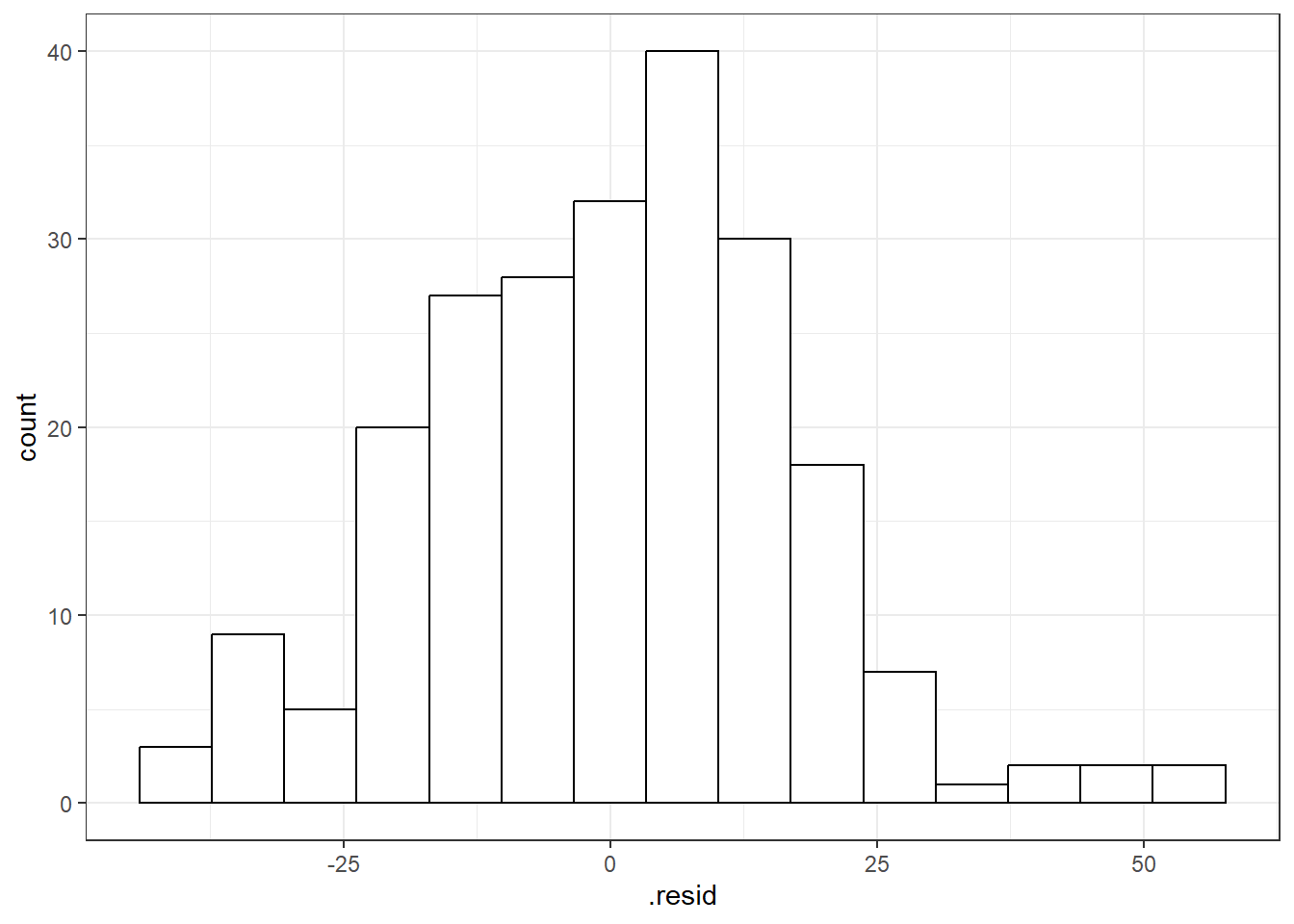
3.14.1 QQ-Plots (QQ stands for QuantileQuantile)
Quantile-Quantile Plot or Probability Plot:
- Order the residuals: \(e_{(1)}, e_{(2)}, ..., e_{(n)}\)
- The parentheses in the denominator indicate that the values are ordered from 1st to last in terms of least to greatest.
- \(e_{(1)}\) is the minimum, \(e_{(n)}\) is the maximum and then there is everything in between.
- Find \(z\) values from the standard normal distribution that match the following:
\[P(Z \leq z_{(i)}) = \frac{3i - 1}{3n -1}\] 3. Plot the \(e_{(i)}\) values against the \(z_{(i)}\) values. You should see a straight line.
3.14.1.1 Good normal QQ-plot:

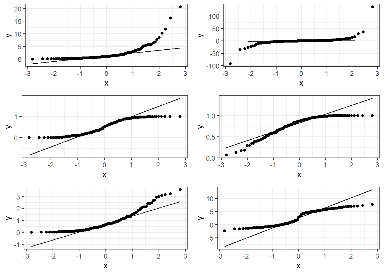
3.14.1.2 Bad plots:
3.14.1.3 Beer QQ Plot
ggplot(beers.lm, aes(sample = .resid)) +
  stat_qq() + stat_qq_line()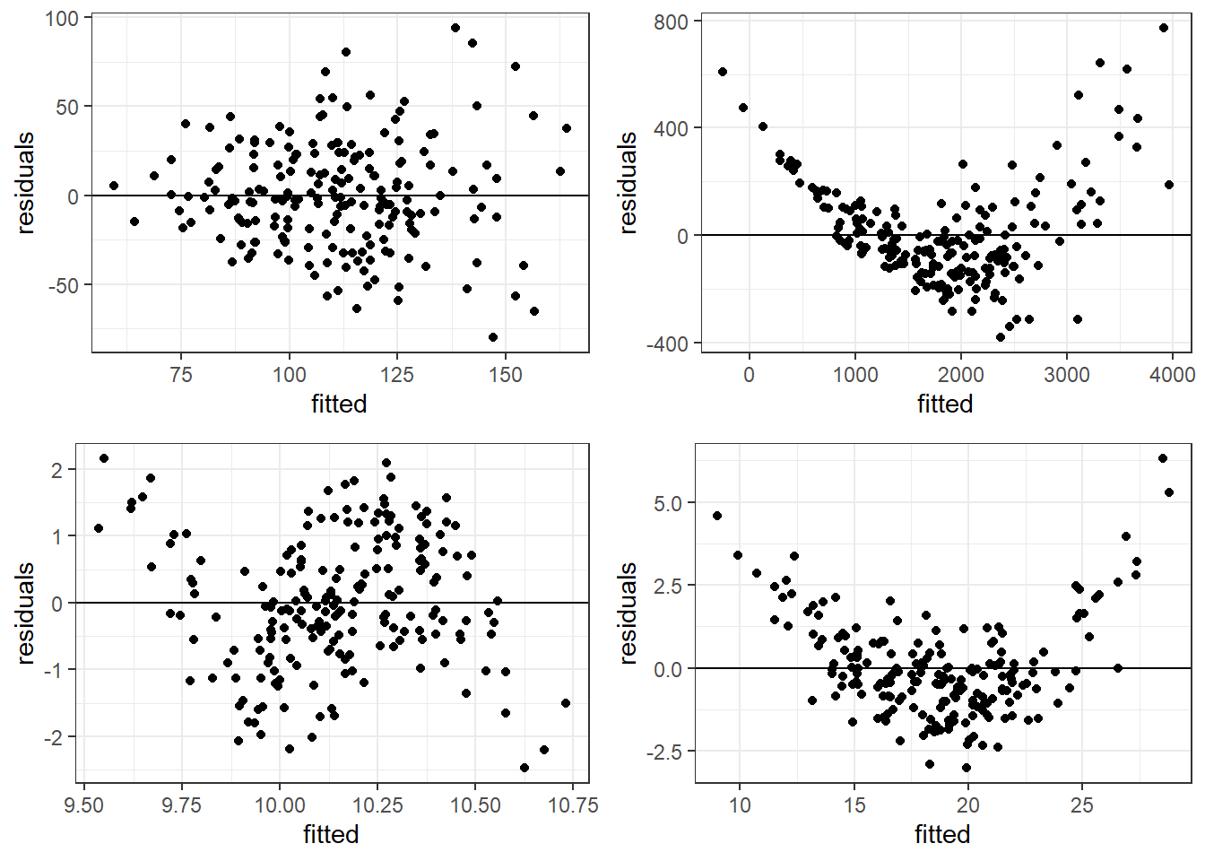
Things for the most part look good.
- There is some deviation at the tails, but that’s expected.
- Essentially there is not much of a pattern to the deviation from the line except for the tails.
- This is honestly pretty ideal and somewhat rare for what we would see in the real world.
3.14.2 Hypothesis Tests for Normality
The hypotheses are:
\(H_0:\) Data are normally distributed \(H_1:\) Data are not normally distributed.
One such test is the Shapiro-Wilk Test which should only be used on model residuals
shapiro.test(beers.lm$residuals)
    Shapiro-Wilk normality test

data:  beers.lm$residuals
W = 0.98379, p-value = 0.01097check_normality(beers.lm)Warning: Non-normality of residuals detected (p = 0.008).3.15 Residual Plots for Assessing Bias and Variance Homogeneity
Residual plots are where we plot the residuals on the vertical axis (y-axis) and the fitted values or observed \(x_i\) values from the data on the horizontal (x-axis).
We can use beers.lm in ggplot().
.fittedcan be used for the fitted values variable..residcan be used for the residuals values variable.
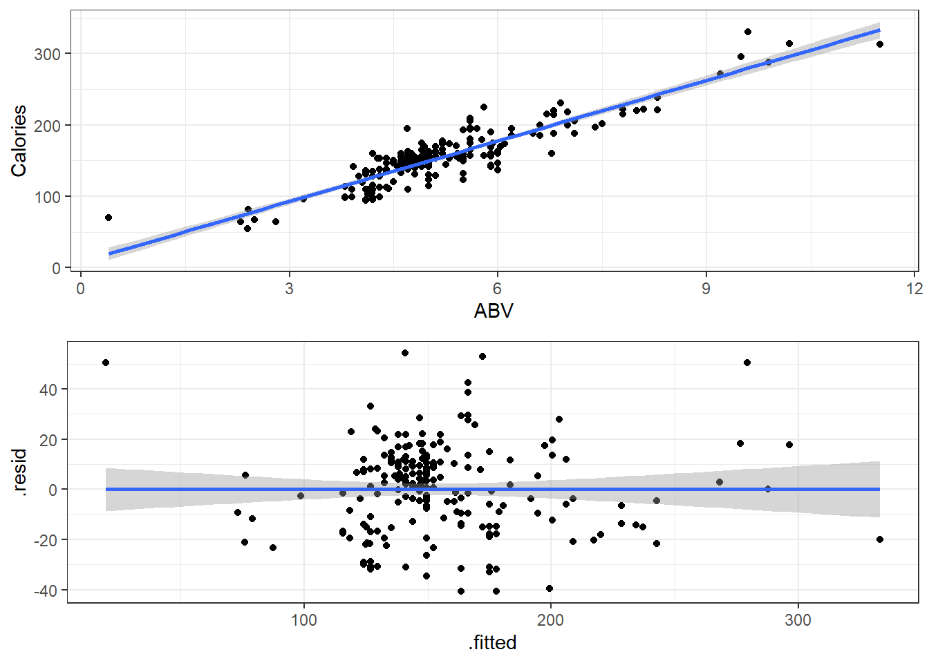
ggplot(beers.lm, aes(x = .fitted, y = .resid)) +
  geom_point() +
  geom_smooth(method = "lm")
3.15.1 Premise of Residual Plots
This is a way to assess whether the mean of the residuals is consistently zero across the regression line.
- This is checking whether the model is biased or not.
- If we see some sort of pattern where the residuals change direction, that means the data do not follow a linear pattern.
It also lets us assess whether the variaibility is constant.
- The residuals should form a pattern with equal vertical dispersion throughout.
- If we see a pattern of increasing or decreasing spread, then the constant variance (homogeneity/homoskedasticity) assumption is violated.
In general, you are look for randomly scattered points with no patterns whatsoever.
The residual plot should form basically a circle or ellipse.
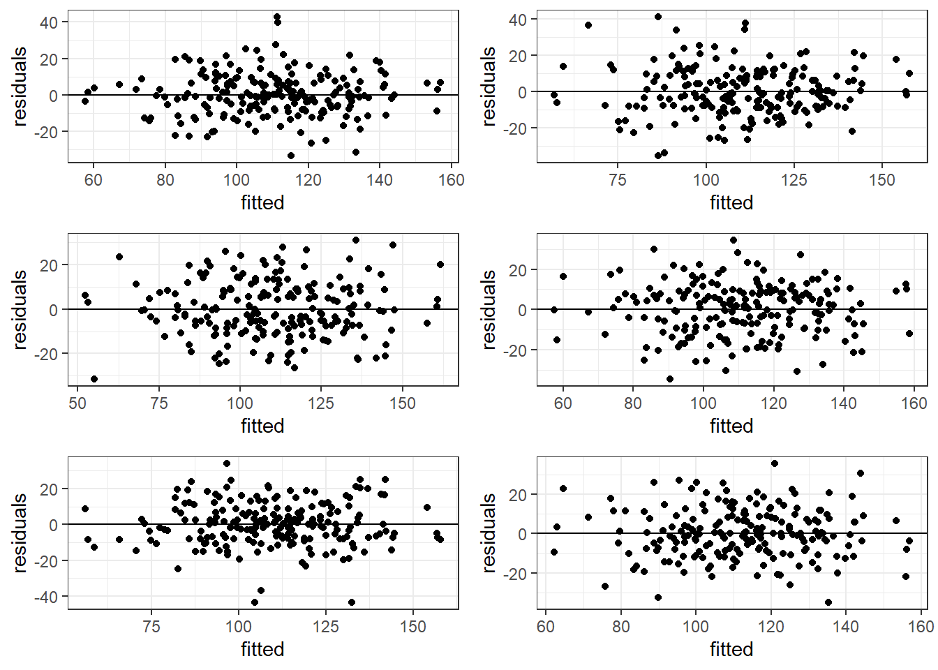
3.15.2 Good Residual Plots
The plots are centered at zero across there isn’t much to say the variability is not constant across the whole plot.
3.15.3 Bad Residual Plots
- Top left plot shows increasing variability but mean of 0. Unbiased and heterogeneous variance.
- Top right show increasing variability AND mean of not 0 consistently. Biased and heterogeneous variance.
- Bottom left shows the mean not being consistently 0. Biased but homogeneous variance.
- Bottom right shows a definite curvature and potential outliers.
3.15.3.1 Beer Data Residual Plots
Let’s look at our beer data residual plots.
ggplot(beers.lm, aes(x = .fitted, y =.resid)) +
  geom_point() +
  geom_smooth(method = "lm")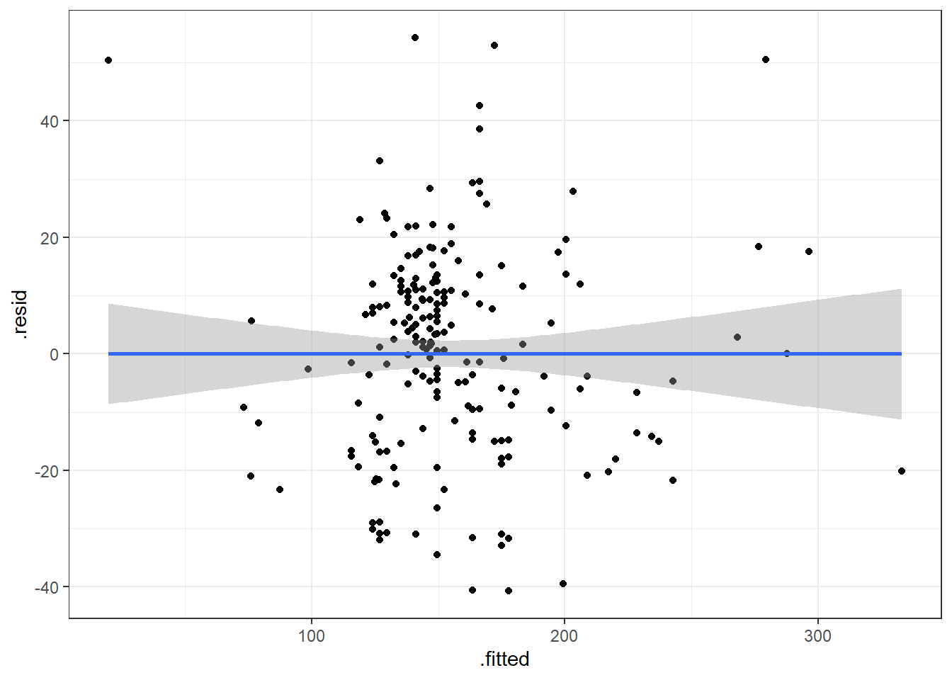
This plot looks mostly fine. There are a few points that stick out on the far right and far left. The most peculiar one is in the top left.
It has the smallest fitted value, so let’s pull that one out.
| Calories | Beer | ABV |
|---|---|---|
| 70 | O’Doul’s | 0.4 |
O’Douls is a “non-alcoholic” beer. It may not be considered representative of our data. We could justify removing it from the data we are analyzing if our objective is analyze “alcoholic” beverages.
3.16 Outliers
Outliers are values that separate themselves from the rest of the data in some “significant way”.
- How do we decide what is, and what is not an outlier.
standardized residuals:
\[z_i = \frac{e_i}{\widehat \sigma_\epsilon} = \frac{y_i - \hat y}{\widehat \sigma_\epsilon}\]
studentized residuals:
\[z^*_i = \frac{e_i}{\widehat \sigma_\epsilon \sqrt{1-h_i}}\]
\(h_i\) is a measure of “leverage”. Leverage is a measure of how extreme a value is in terms of the predictor variable. It indicates the possibility that the outlier could strong influence the estimated regression line.
Sometimes, we use the square root of the standardized/studentized residuals, \(\sqrt{|z_i|}\), to determine outliers. Then we would be looking for values that exceed \(\sqrt{3}\approx 1.7\).
3.17 Alternative Way to Get Residual Diagnostics Graphs
There is a library called ggfortify which has a function that creates some useful plots. It is the autoplot() function.
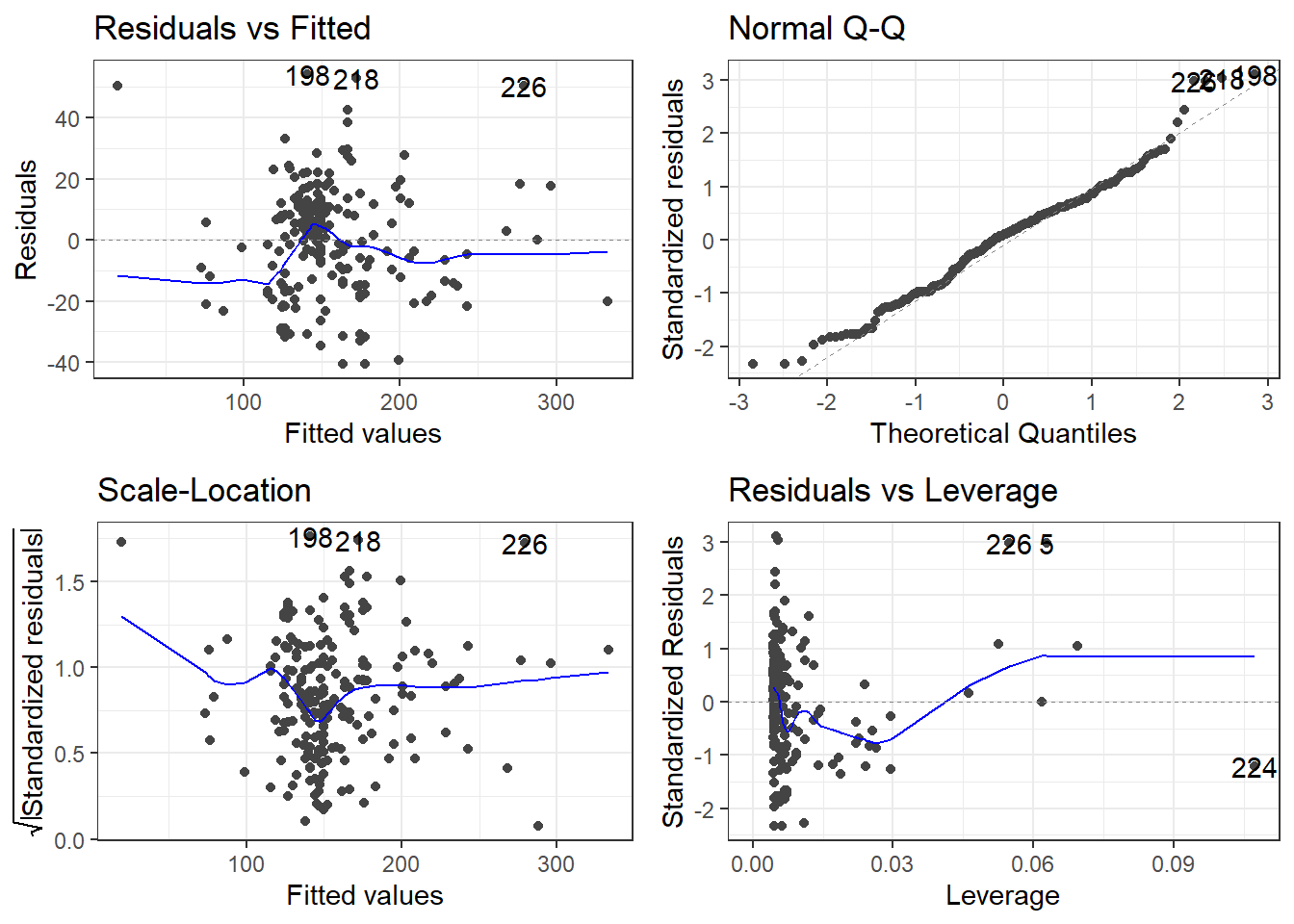
This function only requires your lm model as an input to work. We’ll do this on the original model.
library(ggfortify)

autoplot(beers.lm)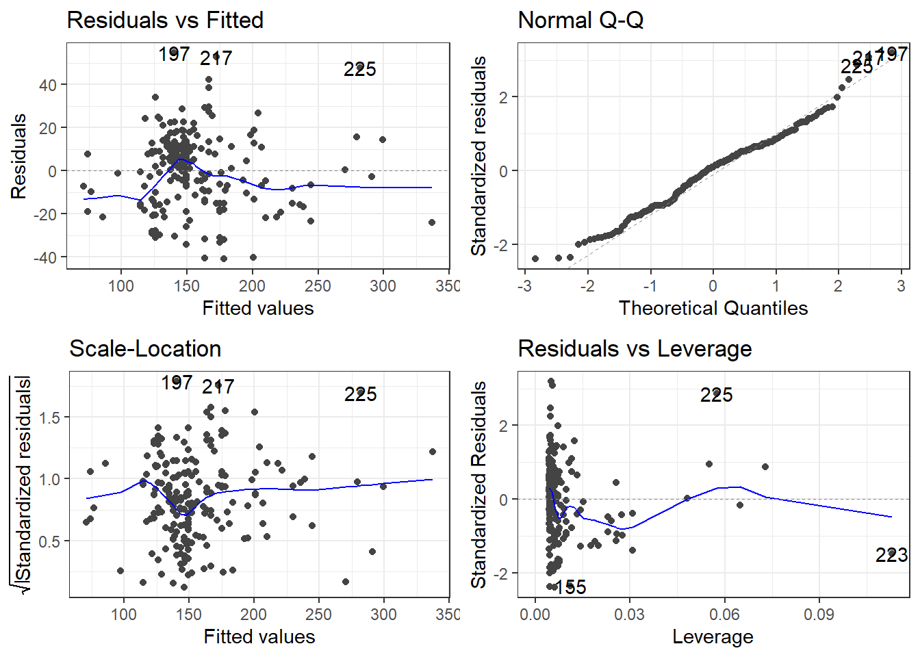
The scale-location plot is a plot of the square root of the standardized/studentized residuals versus the fitted values.
The residuals versus leverage plot. Leverage is essentially a measure of how much potential an observation has for causing a significant change in the line. If an outlier has relatively high leverage, it may be having a large enough impact on the fitted line, that the line is less accurate because of the outlier.
autoplot()automatically labels which observations you may want to consider investigating by tagging observations with which row, numerically, it is in the data.
There is also the performance and see R packages that can be help in checking models.
library(performance)
library(see)

# Test
check_outliers(beers.lm, method = "cook")
OK: No outliers detected.
- Based on the following method and threshold: cook (0.7).
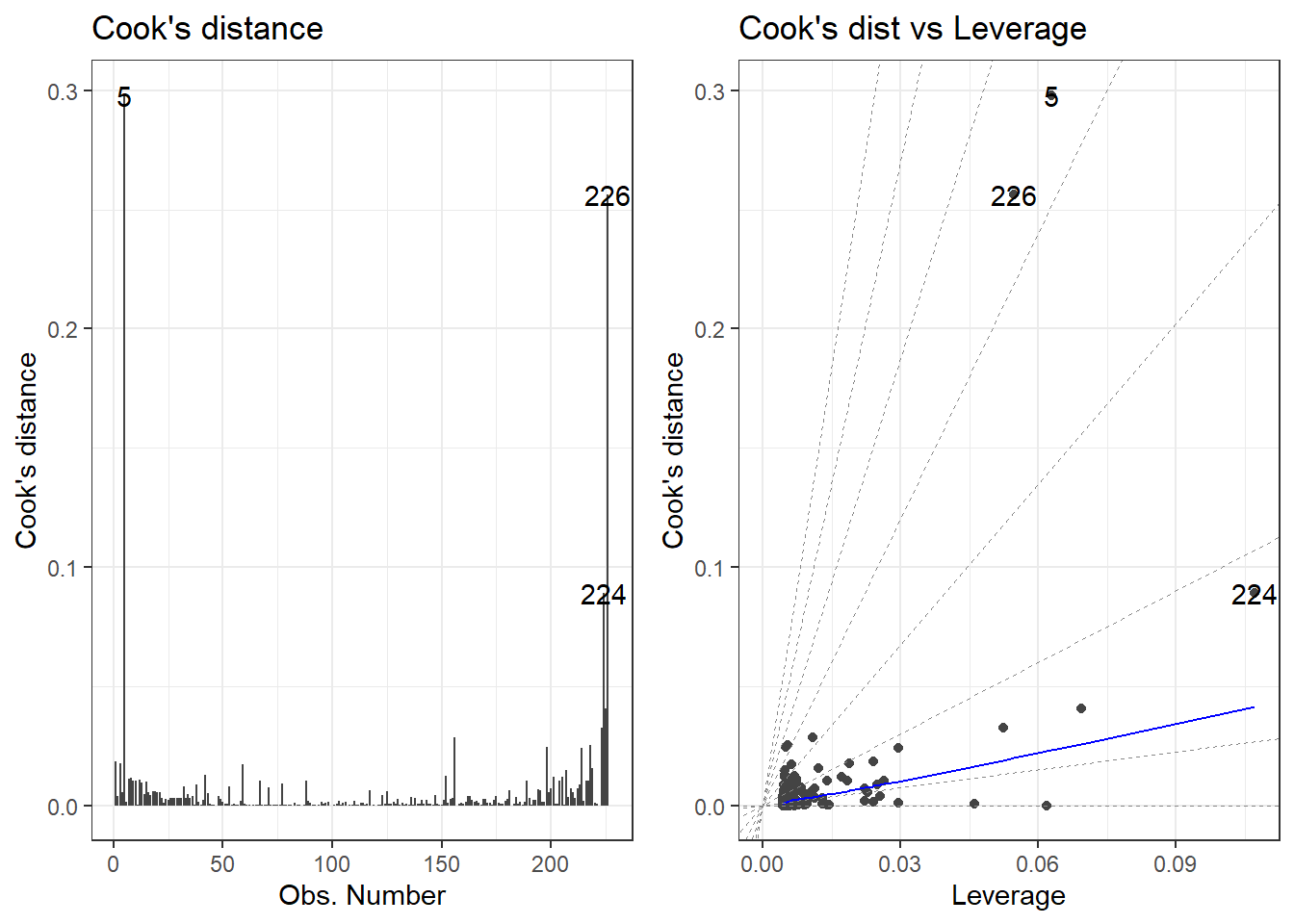
- For variable: (Whole model)# plot
autoplot(beers.lm, which = c(4,6))
plot(check_outliers(beers.lm), type = "dots")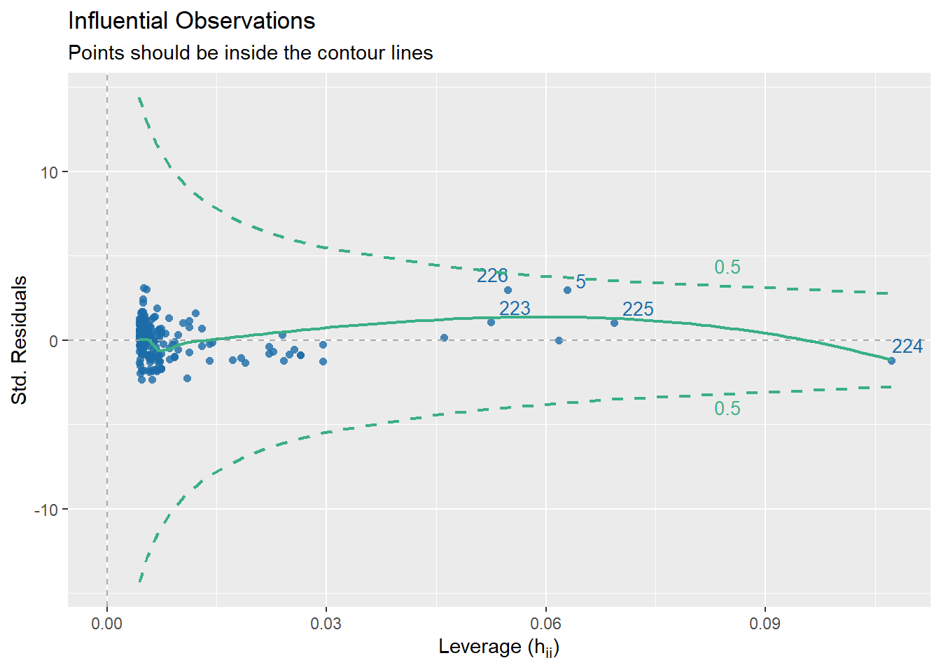
3.18 Getting Outliers from the Data.
data[rows,columns] * Specify the number(s) for which row(s) you want. Leave blank if you want to see all rows. * Specify the number(s) which column(s) you want. Leave blank if you want to see all columns.
Remember, each row in the dataset is a beer. We want to specify just the rows so we can see all the information about each beer we are checking.
# Store the indicated outlier numbers as a vector.

outlierRows <- c(198, 218, 226, 5, 224)

beer[outlierRows, ]
Calories Beer ABV
198 195 Sam Adams Cream Stout 4.69
218 225 Sierra Nevada Stout 5.80
226 330 Sierra Nevada Bigfoot 9.60
5 70 O'Doul's 0.40
224 313 Flying Dog Double Dog\xe5\xca 11.50Maybe there is a pattern here. Maybe these observations should be omitted? If we omit observations, we reduce the generalizability of the model. Generalizability is the ability for a model to apply to a greater population and future predictions.
3.18.1 New Model Without O’Doul’s
Remove outlier(s):
Make a new model.
New residuals check.
Compare to previous model.
beer2 <- filter(beer, Beer != "O'Doul's")

beer2.lm <- lm(Calories ~ ABV, beer2)

summary(beer2.lm)
Call:
lm(formula = Calories ~ ABV, data = beer2)

Residuals:
    Min      1Q  Median      3Q     Max
-41.046 -14.277   1.753  11.081  54.824

Coefficients:
            Estimate Std. Error t value Pr(>|t|)
(Intercept)   4.5978     4.7950   0.959    0.339
ABV          28.9080     0.8966  32.241   <2e-16 ***
---
Signif. codes:  0 '***' 0.001 '**' 0.01 '*' 0.05 '.' 0.1 ' ' 1

Residual standard error: 17.17 on 223 degrees of freedom
Multiple R-squared:  0.8234,    Adjusted R-squared:  0.8226
F-statistic: 1039 on 1 and 223 DF, p-value: < 2.2e-16autoplot(beer2.lm)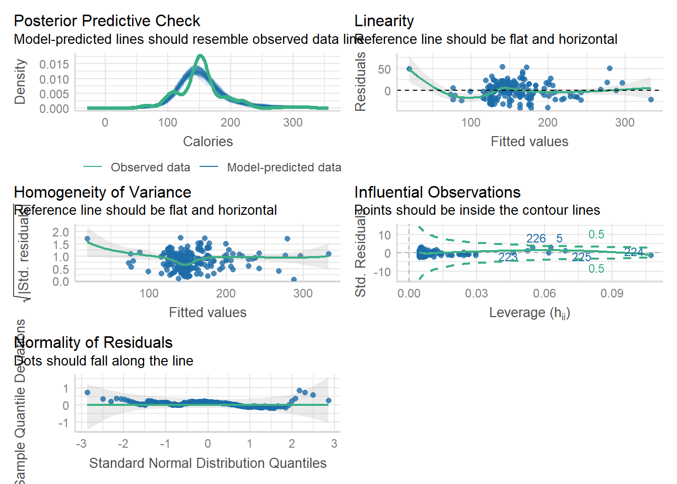
3.19 Specifics of Residual Plots in Simple Linear Regression
One thing to note is that residual plots in simple linear regression are somewhat redundant.
Left: ABV versus Calories
Right: fitted versus residuals
Can you spot the difference? (Besides scale.)
3.19.1 Fitted versus Observed
Another alternative plot is that of actual versus predicted.
- Actual \(y\) values on one axis.
- Predicted \(\hat y\) values on the other axis.
You are looking for a 45 degree line with constant dispersion around the line throughout.
Here it is for the beer data.
ggplot(beers.lm, aes(x = Calories, y = .fitted)) +
  geom_abline(slope = 1,
              color = "royalblue", size = 1) +
  geom_point()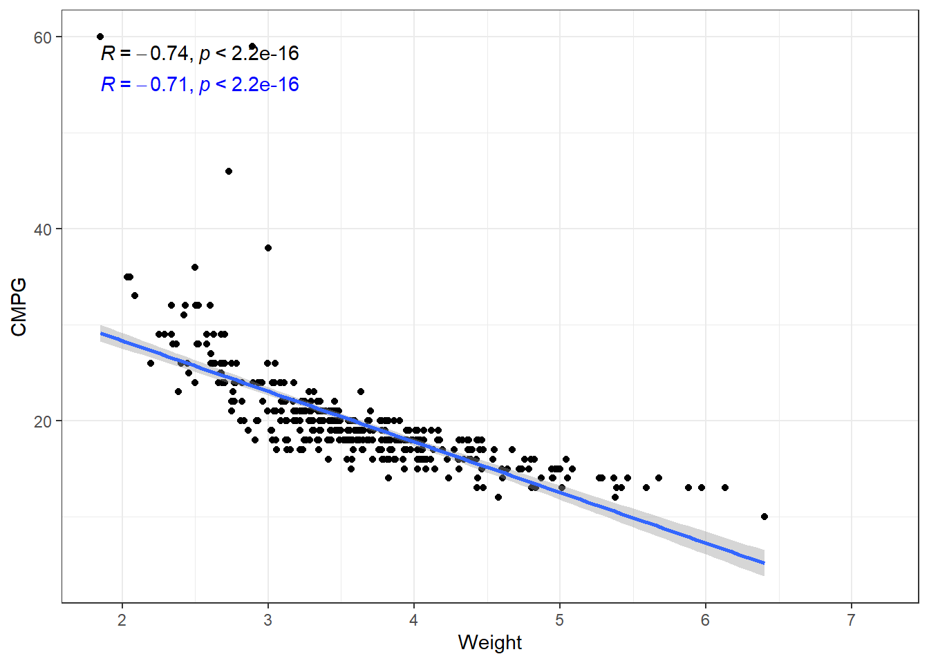
3.20 Dependency and Autocorrelation
3.21 Independence Assumption in Linear Regression
The independence assumption is one of the fundamental assumptions in linear regression modeling. It states that observations in the dataset must be independent of one another.
3.21.1 Key Points
The independence assumption requires that there is no relationship between the residuals (errors) for different observations. Mathematically, this means that
\[Cov(\epsilon_1, \epsilon_2) = 0\]
When this assumption is violated:
- Standard errors become biased
- Hypothesis tests become unreliable
- Confidence intervals are incorrect
- Predictions are less accurate
This is the worst possible scenario for assumption violation
3.21.2 Common Violations
Independence is typically violated in:
- Time series data (temporal autocorrelation)
- Clustered or grouped data (e.g., data is at different schools)
- Spatial data (spatial autocorrelation)
- Repeated measures
3.21.3 Detection Methods
To check for violations of independence (are not good):
- Plot residuals vs. observation order
- Durbin-Watson test for time series data
- Examine autocorrelation function (ACF) plots
- Use variance inflation factors (VIFs)
# not very useful...
# this case is due to *how the data was entered*
check_autocorrelation(beers.lm)
Warning: Autocorrelated residuals detected (p < .001).3.21.4 Solutions
When independence is violated (stuff we don’t cover in class):
- Use time series models (ARIMA, etc.)
- Apply generalized estimating equations (GEE)
- Implement mixed-effects models
- Consider robust standard errors
- Use clustering techniques
The independence assumption is crucial in linear regression. Violations must be identified and addressed to ensure valid statistical inference and reliable predictions.
3.22 General Model Checks
The R see package can also be used to create a general plots for model assumptions:
check_model(beers.lm)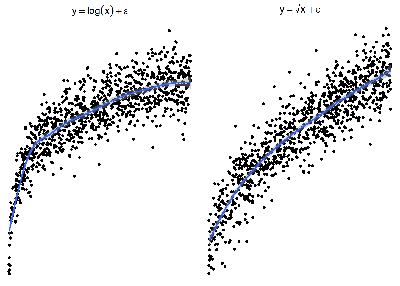
plot(check_predictions(beers.lm))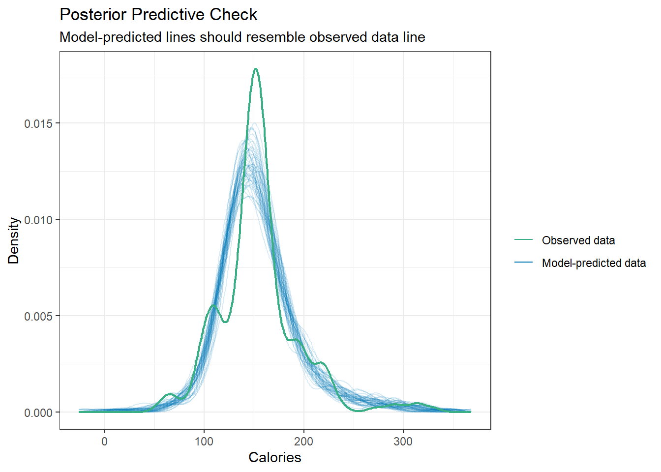
3.23 Transformations
Again our model is
\[y = \beta_0 + \beta_1 x + \epsilon\]
where \(\epsilon \sim N(0,\sigma).\)
\[ x \rightarrow g(x) \]
\[ h(y)= \beta_0 + \beta_1g(x) + \epsilon \]
\[ y \rightarrow h(y) \]
3.24 Not all relations are linear
You’ll have to forgive me for a non-biostatistics example, but it exemplifies what I want to discuss in a simple and easily understandable way (I think).
We’re going to take a look at some cars.
cars <- read_csv(here::here("datasets",
                            'cars04.csv'))
Rows: 428 Columns: 14
── Column specification ────────────────────────────────────────────────────────
Delimiter: ","
chr (3): Name, Type, Drive
dbl (11): MSRP, Dealer, Engine, Cyl, HP, CMPG, HMPG, Weight, WheelBase, Leng...
ℹ Use `spec()` to retrieve the full column specification for this data.
ℹ Specify the column types or set `show_col_types = FALSE` to quiet this message.Several variables to examine, but we’ll just parse it down to looking at the relation between the Weight of vehicles and their fuel efficiency in terms of Miles Per Gallon (MPG). CMPG is the typical MPG in a city environment, and HMPG is the tyical MPG on highways/interstates/non-stop-and-go driving.
3.24.1 Correlations
# I am using arguments in the second stat_cor to change the location of the text
# This is so that the two correlations don't overlap.
ggplot(cars, aes(x = Weight, y = CMPG)) +
  geom_point() +
  geom_smooth(method = "lm", formula = y~x) +
  stat_cor(method = "pearson") +
  stat_cor(method = "kendall", label.y = 55, color = "blue")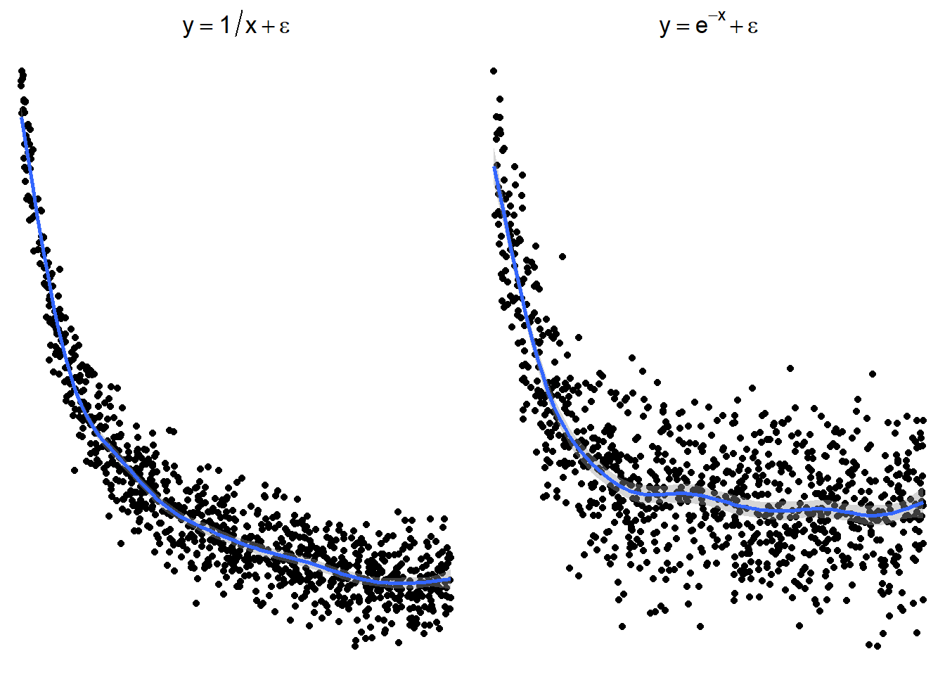
The relation is fairly strong, but does not appear linear. There seems to be a curve to it. The linear model plotted is biased. This means that at some points we expect values to fall below the line more often than not. And other places, we expect the values to fall above the line.
3.24.2 Residuals
This would be reflected residual diagnostics.
carsLm <- lm(CMPG ~ Weight, cars)
autoplot(carsLm)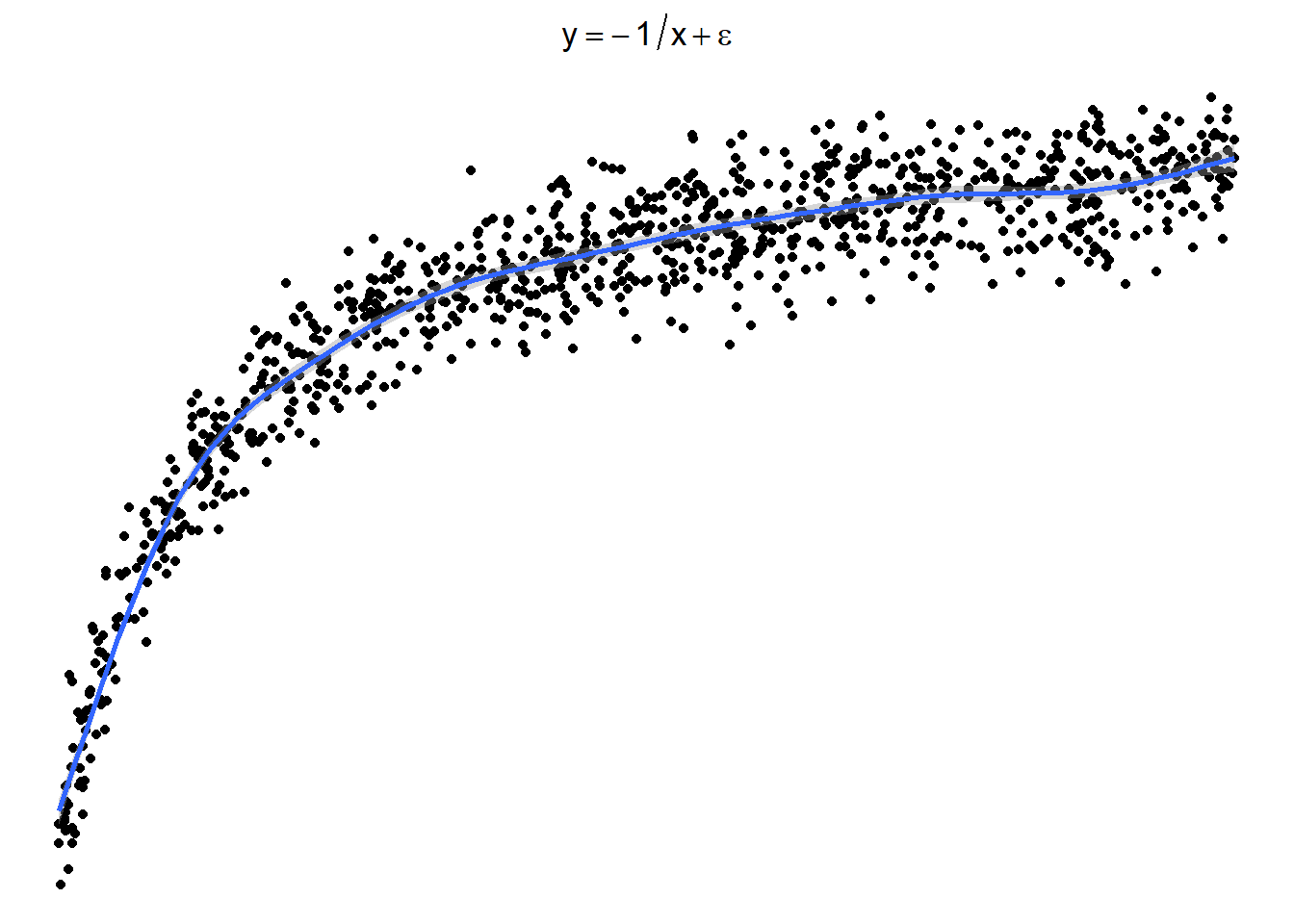
Typically we want to force the data into a linear pattern.
3.24.3 Transformations for Non-linear Relationships
The following plots show several non-linear relationships. With each scatterplot there is the correct transformation for the \(x\) variable.
3.24.3.1 \(\log(x)\) and \(\sqrt x\)
3.24.3.2 \(x^2\) or \(e^x\) (sometimes \(e^x\) is denoted by \(\exp(x)\))
3.24.3.3 \(1/x\) or \(e^{-x}\) (or \(\exp(-x)\))
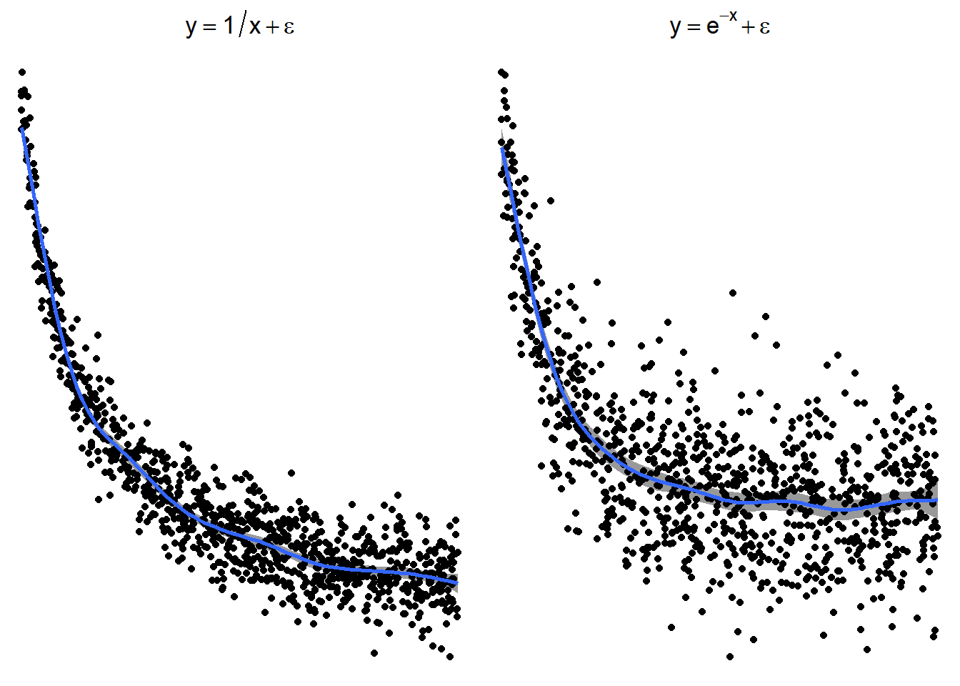
These are just guidelines for which transformations may help. Sometimes the transformations the other transformations may be appropriate because the relationship is flipped by a negative sign.
3.24.3.4 Sometimes things look one way and are another
Here is a graph of the model \(y = -\frac{1}{x} + \epsilon\)

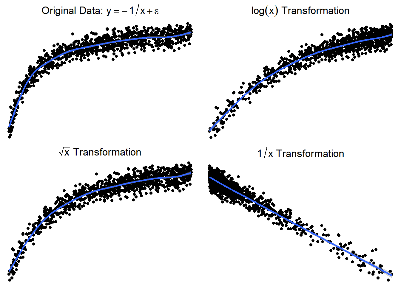
3.24.3.5 Trying \(\log(x)\) or \(\sqrt x\)
Here are side by side graphs of the original data and transforming the \(x\) variable using \(\log(x)\), \(\sqrt x\), and \(1/x\).
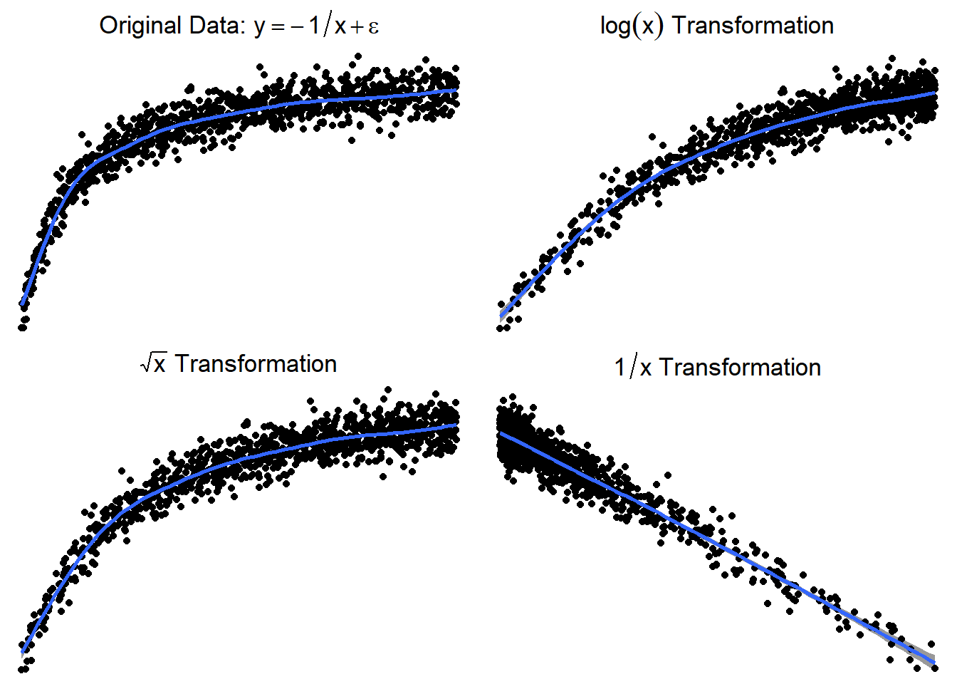
It is important that you try several transformations before giving up on a linear regression model.
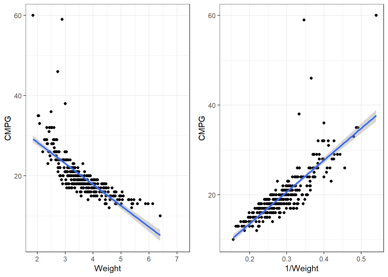
3.24.4 Applying a transformation to the cars dataset
p1 <- ggplot(cars, aes(x = Weight, y = CMPG)) +
  geom_point() +
  geom_smooth(method = "lm")

p2 <- ggplot(cars, aes(x = 1/Weight, y = CMPG)) +
  geom_point() +
  geom_smooth(method = "lm")

grid.arrange(p1,p2, nrow = 1)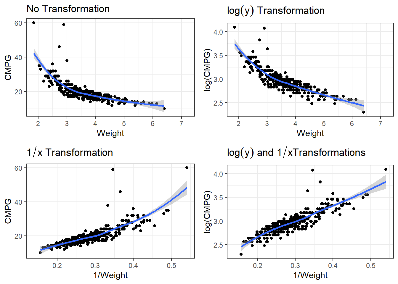
3.24.4.1 Transformations in lm()
When performing transformation in linear models, those can be done within the lm() function. Instead of lm(y ~ x, data), you can put lm(y ~ I(g(x)), data).
g(x)is whatever transformation on the \(x\) variable you are trying.I()is anRsyntax thing that is needed sometimes so that the functiong(x)is interpreted correctly.Though
I()is not always necessary, it is best practice to use it every time you re performing a transformation.
Our function is 1/Weight, so we would write for the formula, y ~ I(1/Weight). In this case, is is necessary to use I(). Try summarising a model where the formula is
carsLm2 <- lm(CMPG ~ I(1/Weight), cars)
summary(carsLm2)
Call:
lm(formula = CMPG ~ I(1/Weight), data = cars)

Residuals:
   Min     1Q Median     3Q    Max
-6.088 -1.302  0.069  1.040 35.073

Coefficients:
            Estimate Std. Error t value Pr(>|t|)
(Intercept)  -0.5651     0.7629  -0.741    0.459
I(1/Weight)  70.7812     2.5606  27.642   <2e-16 ***
---
Signif. codes:  0 '***' 0.001 '**' 0.01 '*' 0.05 '.' 0.1 ' ' 1

Residual standard error: 3.09 on 410 degrees of freedom
  (16 observations deleted due to missingness)
Multiple R-squared:  0.6508,    Adjusted R-squared:  0.6499
F-statistic: 764.1 on 1 and 410 DF,  p-value: < 2.2e-16
3.24.4.2 Residuals
autoplot(carsLm2)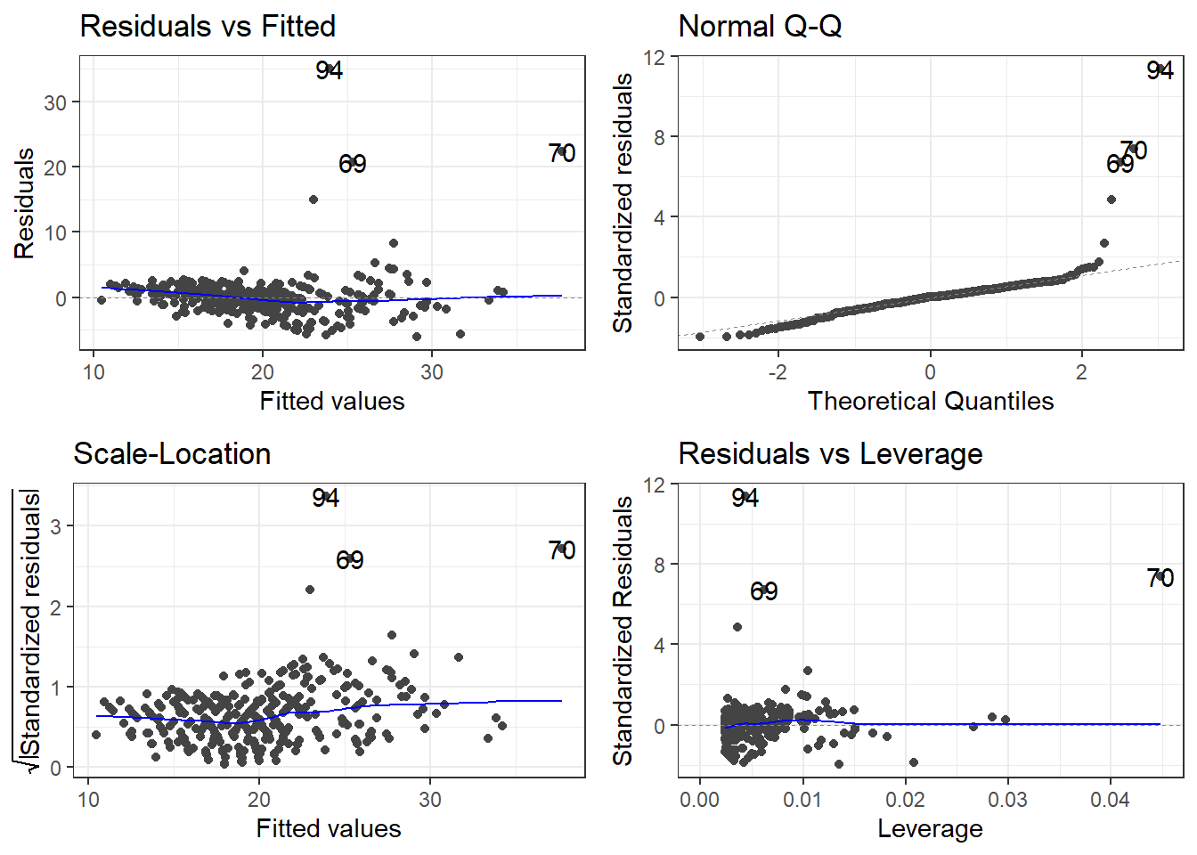
3.25 “Stabilizing” Variability
Sometimes the standard deviation of the residuals is constant on a relative scale.
\[CV = \frac{\sigma_\epsilon}{|\mu_{y|x}|}\] The \(\log\) is typical the transformation used in this situation.
\[\log(y) = \beta_0 + \beta_1 x + \epsilon \qquad \iff \qquad y = e^{\beta_0 + \beta_1 x +\epsilon}\]
Other possibilities would be taking the square root (or higher power root) of the \(y\) variable, but most often it is \(\log\) that works best if a \(y\) transformation is viable.
3.25.1 Log of cars data
There are many potential models. We have to account for non-linearity and the variability issue.
p1 <- ggplot(cars, aes(x = Weight, y = CMPG)) +
  geom_point() +
  geom_smooth() +
  labs(title = expression(paste("No Transformation"))) #expression() lets me show math

p2 <- ggplot(cars, aes(x = Weight, y = log(CMPG))) +
  geom_point() +
  geom_smooth() +
  labs(title = expression(paste(log(y), " Transformation"))) #expression() lets me show math

p3 <- ggplot(cars, aes(x = 1/Weight, y = CMPG)) +
  geom_point() +
  geom_smooth() +
  labs(title = expression(paste(1/x, " Transformation"))) #expression() lets me show math

p4 <- ggplot(cars, aes(x = 1/Weight, y = log(CMPG))) +
  geom_point() +
  geom_smooth() +
labs(title = expression(paste(log(y), " and ", 1/x, "Transformations"))) #expression() lets me show mathgrid.arrange(p1,p2,p3,p4)
3.25.1.1 Linear Model
carsLm3 <- lm(log(CMPG) ~ I(1/(Weight)), data = cars)

summary(carsLm3)
Call:
lm(formula = log(CMPG) ~ I(1/(Weight)), data = cars)

Residuals:
     Min       1Q   Median       3Q      Max
-0.25328 -0.05547  0.00506  0.05825  0.92912

Coefficients:
              Estimate Std. Error t value Pr(>|t|)
(Intercept)    2.03375    0.02710   75.06   <2e-16 ***
I(1/(Weight))  3.22138    0.09094   35.42   <2e-16 ***
---
Signif. codes:  0 '***' 0.001 '**' 0.01 '*' 0.05 '.' 0.1 ' ' 1

Residual standard error: 0.1098 on 410 degrees of freedom
  (16 observations deleted due to missingness)
Multiple R-squared:  0.7537,    Adjusted R-squared:  0.7531
F-statistic:  1255 on 1 and 410 DF,  p-value: < 2.2e-16
carsLm3 <- lm(log(CMPG) ~ I(1/(Weight)), data = cars)
summary(carsLm3)
Call:
lm(formula = log(CMPG) ~ I(1/(Weight)), data = cars)

Residuals:
     Min       1Q   Median       3Q      Max
-0.25328 -0.05547  0.00506  0.05825  0.92912

Coefficients:
              Estimate Std. Error t value Pr(>|t|)
(Intercept)    2.03375    0.02710   75.06   <2e-16 ***
I(1/(Weight))  3.22138    0.09094   35.42   <2e-16 ***
---
Signif. codes:  0 '***' 0.001 '**' 0.01 '*' 0.05 '.' 0.1 ' ' 1

Residual standard error: 0.1098 on 410 degrees of freedom
  (16 observations deleted due to missingness)
Multiple R-squared:  0.7537,    Adjusted R-squared:  0.7531
F-statistic:  1255 on 1 and 410 DF,  p-value: < 2.2e-16
So \[\widehat{\log(CMPG)} = 2.03 + 3.22\frac{1}{Weight}\] is our estimated regression line.
3.25.1.2 Residuals
autoplot(carsLm3)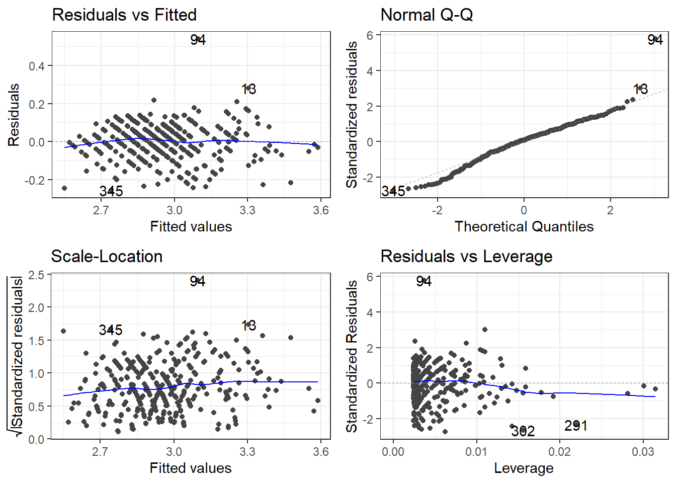
3.25.1.3 Outliers
outliers <- c(94, 69, 97, 70)

cars[outliers, ]
# A tibble: 4 × 14
Name Type Drive MSRP Dealer Engine Cyl HP CMPG HMPG Weight WheelBase
<chr> <chr> <chr> <dbl> <dbl> <dbl> <dbl> <dbl> <dbl> <dbl> <dbl> <dbl>
1 Toyo… Car FWD 20510 18926 1.5 4 110 59 51 2.89 106
2 Hond… Car FWD 20140 18451 1.4 4 93 46 51 2.73 103
3 Volk… Car FWD 21055 19638 1.9 4 100 38 46 3.00 99
4 Hond… Car FWD 19110 17911 2 3 73 60 66 1.85 95
# ℹ 2 more variables: Length <dbl>, Width <dbl>filter(cars, Weight < 2.1)# A tibble: 4 × 14
Name Type Drive MSRP Dealer Engine Cyl HP CMPG HMPG Weight WheelBase
<chr> <chr> <chr> <dbl> <dbl> <dbl> <dbl> <dbl> <dbl> <dbl> <dbl> <dbl>
1 Toyo… Car FWD 10760 10144 1.5 4 108 35 43 2.04 93
2 Toyo… Car FWD 11560 10896 1.5 4 108 33 39 2.08 93
3 Toyo… Car FWD 11290 10642 1.5 4 108 35 43 2.06 93
4 Hond… Car FWD 19110 17911 2 3 73 60 66 1.85 95
# ℹ 2 more variables: Length <dbl>, Width <dbl>removeOutliers <- c(94, 69, 70)
cars2 <- cars[-removeOutliers, ]3.25.1.4 Removing outliers and new model
carsLm4 <- lm(log(CMPG) ~ I(1/Weight), cars2)

summary(carsLm4)
Call:
lm(formula = log(CMPG) ~ I(1/Weight), data = cars2)

Residuals:
     Min       1Q   Median       3Q      Max
-0.25752 -0.05228  0.00710  0.05943  0.54103

Coefficients:
            Estimate Std. Error t value Pr(>|t|)
(Intercept)  2.06635    0.02359   87.60   <2e-16 ***
I(1/Weight)  3.09371    0.07948   38.92   <2e-16 ***
---
Signif. codes:  0 '***' 0.001 '**' 0.01 '*' 0.05 '.' 0.1 ' ' 1

Residual standard error: 0.09357 on 407 degrees of freedom
  (16 observations deleted due to missingness)
Multiple R-squared:  0.7882,    Adjusted R-squared:  0.7877
F-statistic:  1515 on 1 and 407 DF,  p-value: < 2.2e-16
Compare to model with outliers.
3.25.1.5 Checking residuals AGAIN
autoplot(carsLm4)
3.26 Box-Cox Transformation Explained
The Box-Cox transformation is a powerful statistical technique used to stabilize variance, make data more normal-distributed, and improve the fit of linear models. Named after statisticians George Box and David Cox who introduced it in 1964, this transformation is particularly useful when dealing with skewed data.
3.26.1 Mathematical Definition
The Box-Cox transformation is defined as:
\[Y(\lambda) = \begin{cases} \frac{Y^\lambda - 1}{\lambda} & \text{if } \lambda \neq 0 \\ \ln(Y) & \text{if } \lambda = 0 \end{cases}\]
Where: - \(Y\) is the response variable being transformed - \(\lambda\) (lambda) is the transformation parameter - \(Y(\lambda)\) is the transformed value
3.26.2 Why Use It?
Box-Cox transformations help address several common issues in linear modeling:
- Non-constant variance (heteroscedasticity)
- Non-normal distribution of errors
- Non-linearity in relationships between variables
3.26.3 Common Lambda Values
- \(\lambda = 1\): No transformation (original data)
- \(\lambda = 0.5\): Square root transformation
- \(\lambda = 0\): Natural log transformation
- \(\lambda = -1\): Reciprocal transformation
3.26.4 Finding the Optimal Lambda
The optimal \(\lambda\) value maximizes the log-likelihood function and can be found through: - Statistical software packages (R, Python, SAS) - Box-Cox plots that show log-likelihood values for different \(\lambda\) values - If 1 excluded from the 95% confidence interval, we can probably reject that no transformation is necessary.
3.26.5 Important Considerations
- Box-Cox only works on positive data values
- The transformed data must be interpreted carefully, as the scale changes
- When reporting results, consider back-transforming to the original scale
3.27 You’ve got a linear model, now what
\[\widehat{\log(CMPG)} = 2.03 + 3.22\frac{1}{Weight} \qquad \iff \qquad \widehat{CMPG} = e^{2.03 + 3.22\frac{1}{Weight}} \]
3.27.1 Interpreting you coefficients
We’ve got this model. How would we explain what it says?
\[\widehat{\log(CMPG)} = 2.03 + 3.22\frac{1}{Weight}\]
This means we are looking at how \(1/Weight\) affects the relative change of \(CMPG\). What does that mean?
Say you were to look at the average weight of cars that weighed \(d\) thousand pounds more. The change in log of CMPG is
\[\Delta \log(CMPG) = \frac{3.22}{Weight + d} - \frac{3.22}{Weight} = \frac{-3.22d}{Weight^2 + d\cdot Weight}\]
Using math “magic”.
\[CMPG_d = CMPG_0 \cdot e^{\frac{-3.22d}{Weight^2 + d\cdot Weight}}\]
In terms of viewing the model as \(\widehat{CMPG} = e^{2.03 + 3.22\frac{1}{Weight}}\) the change in \(CMPG\) would be
\[\Delta \widehat{CMPG} = \left(e^{2.03 + 3.22\frac{1}{Weight}}\right) - \left(e^{2.03 + 3.22\frac{1}{Weight + d}}\right)\]
I don’t know about this form either.
3.28 A marginal view
From our statistical models, we could look at the marginal effect. We will go into further depth later this semester.
Formally defined, a marginal effect is a partial derivative from a regression equation. It’s the instantaneous slope of one of the explanatory variables in a model, with all the other variables held constant.
I.e., controlling all else, the estimated change would we expect in the original unit scale for a given change in the predictor unit scale
We can get the slope at every data point, specific data points, or averaged over the data the model was fit upon.
3.28.1 Predictions
# This package is very useful
library(marginaleffects)

plot_predictions(carsLm4, "Weight", transform = "exp")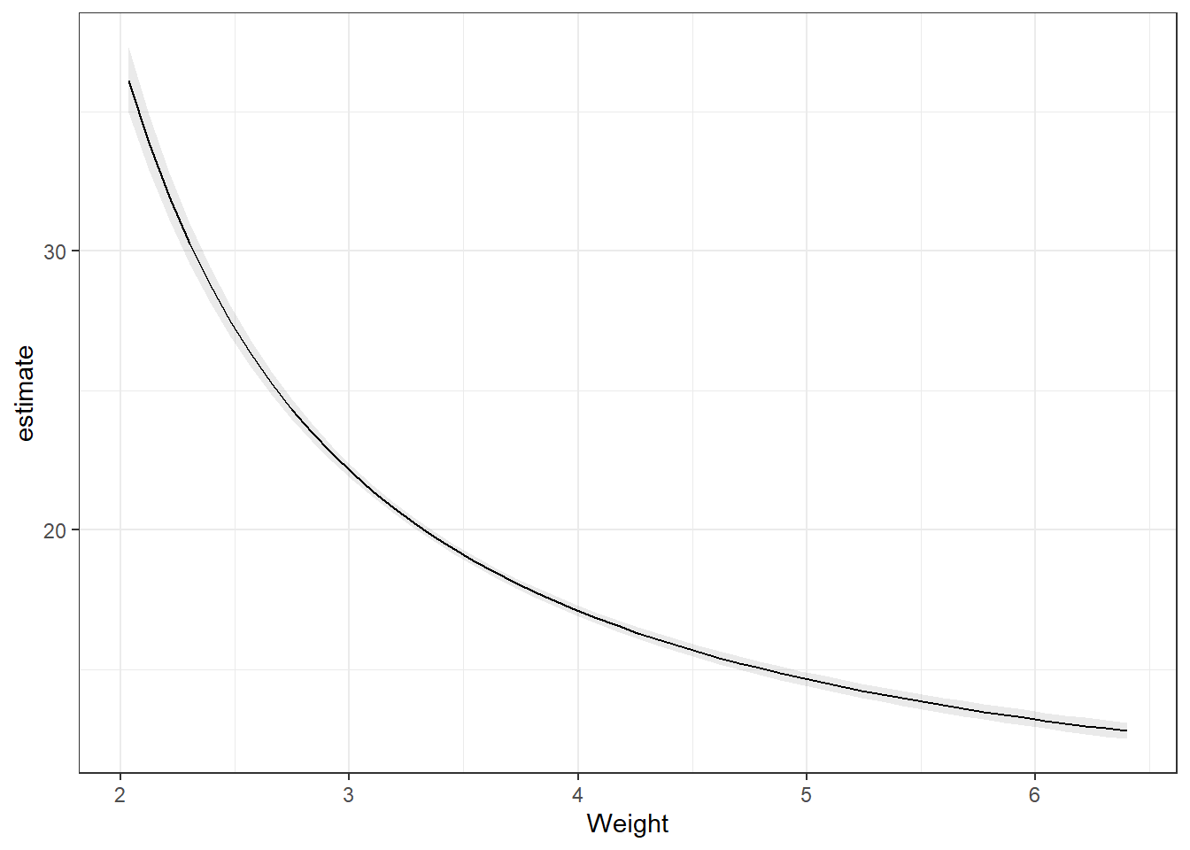
3.28.2 Slopes
Remember the partial derivatives. Look at the predictions, the slope of that line dampens as Weight increases.
Note, the slope is on the log scale! Much easier if we didn’t transform the dependent variable.
# On the log scale
plot_slopes(carsLm4, variables = "Weight",
            condition = "Weight")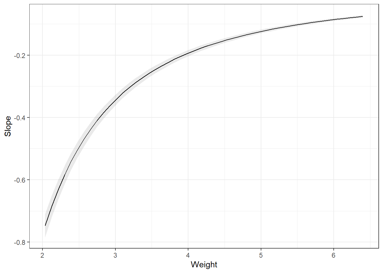
# The slope back transformed: a Ratio
plot_slopes(carsLm4, variables = "Weight",
            condition = "Weight", transform = "exp")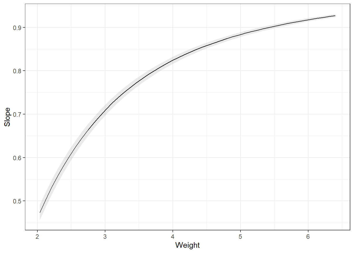
3.28.3 Summarizing
You can the average slope of all the data points. This is the average partial derivative of the line in the plot_predictions plot over all observed data. I.e., this is the average change in the outcome, on the log scale which can be interpreted as a percentage change, if every observed data point increased weight by 1 unit. This is the average marginal effect (AME).
avg_slopes(carsLm4, variables = "Weight")
 Estimate Std. Error     z Pr(>|z|)   S  2.5 % 97.5 %
   -0.273      0.007 -38.9   <0.001 Inf -0.286 -0.259

Term: Weight
Type: response
Comparison: dY/dX
Another way is to summarize at the average weight. This is the marginal effect at the mean (MEM). Notice, they are different.
avg_slopes(carsLm4, variables = "Weight", newdata = "mean")
 Estimate Std. Error     z Pr(>|z|)   S  2.5 % 97.5 %
   -0.242    0.00622 -38.9   <0.001 Inf -0.254  -0.23

Term: Weight
Type: response
Comparison: dY/dX
We could also want the average marginal effect at a representative value.
slopes(carsLm4, newdata = datagrid(Weight = c(2, 4, 6)))
 Weight Estimate Std. Error     z Pr(>|z|)   S   2.5 %  97.5 %
      2  -0.7734    0.01987 -38.9   <0.001 Inf -0.8124 -0.7345
      4  -0.1934    0.00497 -38.9   <0.001 Inf -0.2031 -0.1836
      6  -0.0859    0.00221 -38.9   <0.001 Inf -0.0903 -0.0816

Term: Weight
Type: response
Comparison: dY/dX
3.28.4 Comparisons
Lastly, we may want to get the average marginal effect on a different scale of change in variable.
Difference from one SD below the mean to one SD above the mean.
preds = avg_predictions(carsLm4, variables = list(Weight = "sd"), transform = "exp")
preds
 Weight Estimate Pr(>|z|)   S 2.5 % 97.5 %
   3.21     20.7   <0.001 Inf  20.5   20.9
   3.94     17.3   <0.001 Inf  17.1   17.5

Type: responsehypotheses(preds, "b2 - b1 = 0")
 Hypothesis Estimate Std. Error    z Pr(>|z|)   S 2.5 % 97.5 %
    b2-b1=0    -3.37    0.00456 -738   <0.001 Inf -3.37  -3.36
Difference from the 1st quartile below to the 3rd quartile above the mean.
preds = avg_predictions(carsLm4, variables = list(Weight = "iqr"), transform = "exp")
preds
 Weight Estimate Pr(>|z|)   S 2.5 % 97.5 %
   3.12     21.3   <0.001 Inf  21.1   21.5
   3.98     17.2   <0.001 Inf  17.0   17.4

Type: responsehypotheses(preds, "b2 - b1 = 0")
 Hypothesis Estimate Std. Error    z Pr(>|z|)   S 2.5 % 97.5 %
    b2-b1=0     -4.1     0.0055 -746   <0.001 Inf -4.11  -4.09
3.28.5 Predictions from transformations
You create a data.frame that contains the values of the predictor variable that you want predictions for, and then plug them into the predict() function.
newdata <- data.frame(Weight = c(1.5, 2, 2.5, 3, 3.5, 4))

predictions <- predict(carsLm4, newdata)
Now let’s look at those predictions.
predictions 1 2 3 4 5 6
4.128824 3.613205 3.303834 3.097587 2.950267 2.839777 There’s an issue here. These are the predictions for \(\log(CMPG)\), not CMPG. You have to use the reverse function on the predictions. In this case, log(y) takes the natural log of \(y\). Therefore, your reverse function is \(e^y\) using exp(y).
exp(predictions) 1 2 3 4 5 6
62.10485 37.08473 27.21679 22.14445 19.11106 17.11196 3.28.5.1 Confidence and Interval Intervals
Likewise, if you wanted confidence intervals for the mean, or prediction intervals for future observations, you would specify an interval = "confidence" or interval = "prediction" argument and a level argument specifying the desired confidence level for your intervals. AND you need to apply the reverse function.
CIs <- predict(carsLm4, newdata, interval = "confidence", level = 0.99)

PIs <- predict(carsLm4, newdata, interval = "prediction", level = 0.99)
Here are the 99% confidence intervals.
exp(CIs) fit lwr upr
1 62.10485 57.43392 67.15565
2 37.08473 35.46636 38.77696
3 27.21679 26.53386 27.91730
4 22.14445 21.81908 22.47467
5 19.11106 18.88265 19.34223
6 17.11196 16.86310 17.36448And here are the 99% prediction intervals.
exp(PIs) fit lwr upr
1 62.10485 48.15157 80.10149
2 37.08473 28.99050 47.43889
3 27.21679 21.33490 34.72030
4 22.14445 17.37399 28.22475
5 19.11106 14.99637 24.35473
6 17.11196 13.42575 21.81026Confidence levels when you apply the reverse transformations are only approximate. Actual confidence may be higher or lower. Something about this thing called Jensen’s inequality…